Homepage Design Principles: What Works in 2026
Ten homepage design principles, the section order that suits most sites, and the speed, accessibility and search checks to run before launch.
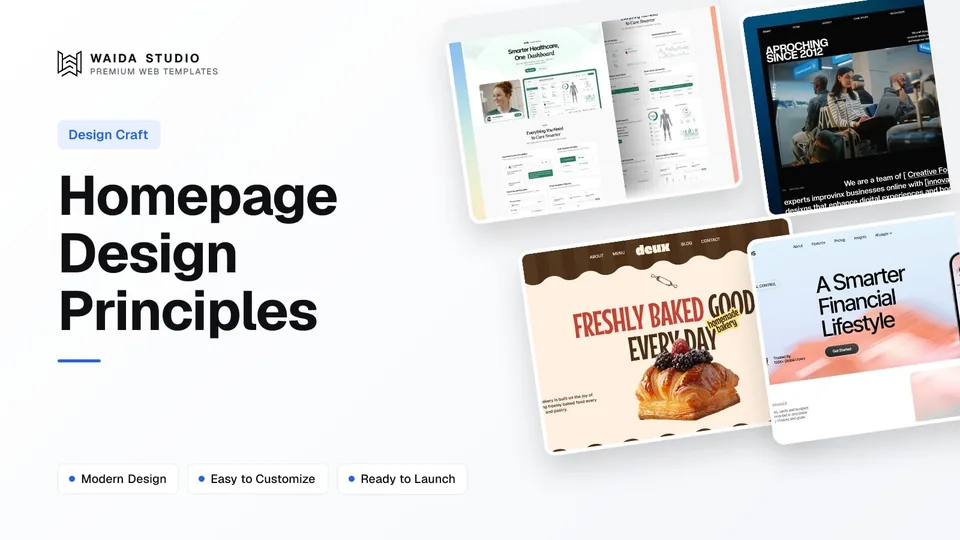
Good homepage design principles come down to this: say what you do and who it is for in the first screen, give one main next step, route every kind of visitor to the page they need, show proof, and keep the page fast and readable on a phone. Everything else is detail.
What Is a Homepage For?
A homepage is the front door for every kind of visitor at once. Some arrive knowing your name, some from a search result, some to check you are real before they call. Its job is to orient all of them quickly and send each one to the right page, not to close every sale on its own.
That is the main difference from a landing page. A landing page serves one audience and one offer, usually from an ad or a campaign, and removes everything that distracts from a single action. Our guide to landing page design covers that format. A homepage keeps the navigation, shows the range of what you offer and points onward.
Homepage | Landing page | |
|---|---|---|
Audience | Everyone: new, returning, curious, checking | One segment from one source |
Goal | Orient and route to the right page | One conversion |
Navigation | Full menu and footer | Often removed or reduced |
Content | Overview of offers, proof, next steps | One offer argued in depth |
Lifespan | Years, updated as the business changes | As long as the campaign runs |
Ten Homepage Design Principles
These ten principles cover what a homepage has to get right whatever the platform or industry. The first three decide whether people stay; the rest decide whether they find what they came for and trust what they see.
- Say what you do in plain words. The headline names the product, service or work. A slogan that could sit on any company's site makes visitors guess.
- Say who it is for. The supporting line names the customer and the change you make for them. Our hero section guide breaks this first screen into its five parts.
- Give one primary action. One filled button for the main step (book, start, shop, contact). Secondary actions are text links or outlined buttons, never equal weight.
- Route every visitor. Clear navigation labels and a short overview of each offer, each linking to its own page, so people never have to hunt through the menu.
- Show proof close to claims. Client logos, named reviews, case studies or real numbers, placed next to the claim they support rather than in one block at the bottom.
- Follow a predictable order. Problem, offer, proof, next step. Visitors scan, so familiar patterns let them find things without thinking.
- Keep each section to one idea. A heading that states the point, a short paragraph, and a visual that shows it. If a section needs two headings, it is two sections.
- Write for scanning. Headings people can read on their own, short paragraphs, and type that stays readable on a phone. Our guide to website fonts covers sizes and pairings.
- Make it fast. The first screen should load quickly on a mid-range phone; heavy video and oversized images are the usual culprits.
- Repeat the next step at the end. People who scroll to the bottom are interested. Give them the primary action again, plus contact details in the footer.
The first screen deserves the most care. In Nielsen Norman Group's 2018 eyetracking research, people spent about 57% of their page-viewing time above the fold and 74% in the first two screenfuls, according to its article on scrolling and attention. People do scroll, but the top of the page gets the most looks.
The Section Order That Works for Most Homepages
Most effective homepages run in roughly the same order: hero, proof strip, offers, how it works, deeper proof, a final call to action, then the footer. Change the order when your visitors need something sooner, such as prices on a shop or opening hours on a café, but start from this sequence.
Section | Its job | Keep it to |
|---|---|---|
Hero | What you do, who for, one main action | Headline, one line, one button, one visual |
Proof strip | Instant credibility | Logos, a rating or one short named quote |
Offers or features | Show the range and route people onward | 3–6 cards, each linking to its own page |
How it works | Remove the fear of the unknown | 3–4 steps |
Deeper proof | Back up the claims | Case studies, reviews or work samples |
FAQ (optional) | Answer the questions that stop people | 4–8 short answers |
Final call to action | Catch people who scrolled to the end | The same primary action as the hero |
Footer | Contact, legal, secondary navigation | Grouped links, address, social |
Planning this order before any visual work saves rework. A grey-box wireframe of the sections, like the ones in our website wireframe examples, shows quickly whether the page tells a sensible story.
Homepage Layout by Site Type
The principles stay the same, but what goes first changes with the kind of site. A SaaS homepage leads with the product, a portfolio with the work, a local business with location and hours, and a shop with products and prices. Use this table to decide what belongs in the hero and directly below it.
Site type | Hero should show | Right below the hero | Primary action |
|---|---|---|---|
SaaS or app | Product screen and the core outcome | Logos of customers, key features | Start free or book a demo |
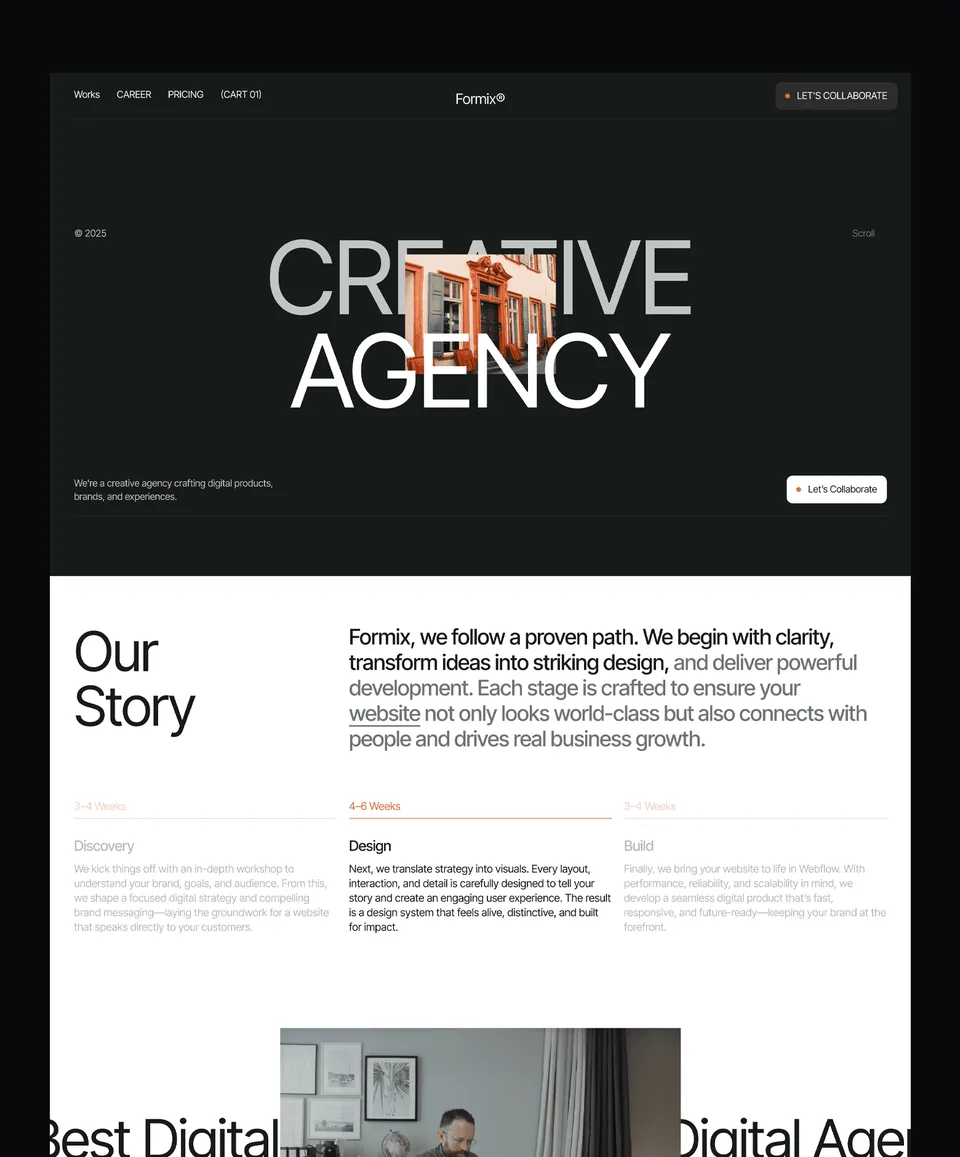
Agency or studio | Best recent work and what you do | Services, selected case studies | Start a project |
Portfolio | The work itself and your discipline | Project grid | Contact or hire me |
Local business | Service, area and a phone number | Hours, location, reviews | Call or book |
Café or restaurant | Food photography and opening hours | Menu, location | Order or reserve |
Online shop | Products or a current collection | Categories, bestsellers | Shop now |
If your site is small enough that one long page does the whole job, the homepage and the site become the same thing. Our guide to one page website design explains when that works and when it starts to strain.
Speed, Accessibility and Search Basics
A homepage that looks right but loads slowly, has low-contrast text or confuses search engines undoes the design work. Three sets of checks catch most of it: Google's Core Web Vitals for speed, WCAG contrast for readability, and WebSite structured data so Google shows the right site name.
Check | Target | Source |
|---|---|---|
Largest Contentful Paint | 2.5 seconds or less | |
Interaction to Next Paint | 200 milliseconds or less | |
Cumulative Layout Shift | 0.1 or less | |
Body text contrast (AA) | At least 4.5:1 | |
Large text contrast (AA) | At least 3:1 (about 24px, or 18.5px bold) | |
Site name in Google | WebSite structured data on the homepage |
Google measures the Core Web Vitals at the 75th percentile of page loads, split by mobile and desktop, so test on a phone, not only your laptop. The hero image is often the largest element, so compress it, size it correctly and avoid autoplaying video that pushes it back.
Google's site name documentation says it uses content from your home page to choose the name shown in results, and that WebSite structured data with a name and url on the home page is the main way to state your preference. The title tag and main heading are considered too, so keep your business name consistent across them.
Common Homepage Mistakes
Most weak homepages fail in the same few ways: they are vague, they ask for too many things at once, or they make visitors work to find the next page. Run through this list before you publish, then use our website launch checklist for the technical side.
- A carousel as the hero. Rotating slides split attention and hide every message but the first. Pick one message.
- Five buttons in the first screen. If everything is important, nothing is. Keep one primary action.
- Vague headlines. "Building the future together" says nothing. Name what you sell.
- Proof without names. Anonymous quotes and unsourced numbers read as filler. Use real names, logos or linked case studies.
- Navigation labels in house language. Visitors look for Services, Work, Pricing and Contact, not invented labels.
- Desktop-only design. Check the stacking order, tap targets and text size on a phone before anything else.
- No contact details. Put an email, phone or booking link in the footer of every page, including the homepage.
Waida Templates That Follow These Principles
If you would rather start from a working homepage than a blank page, these four Waida Studio templates show the principles in practice. We made them, so treat this as our own work, not an independent review. Each has a homepage with one main action, a clear section order and a mobile layout.
Medonix (SaaS, free everywhere)

Medonix is a 13-page medical SaaS template. Its homepage follows the SaaS pattern: product positioning first, then features, proof and repeated calls to action. It is free on Framer, Webflow, HTML, Next.js and Astro with a free Waida account, and its Figma file is free too.
Zelda (agency, free everywhere)

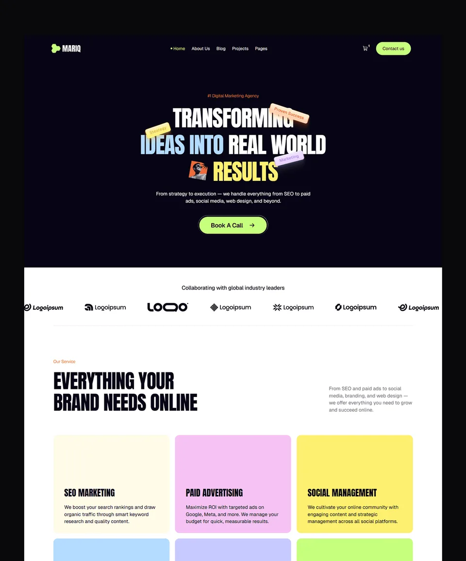
Zelda is a 13-page template for creative agencies and studios. The homepage leads with the studio's work and services, which suits the agency row in the table above. Like Medonix, it is free on every platform with a free Waida account, Figma file included.
Deux (bakery and café)

Deux is a bakery and pastry-shop template with menu tabs, 15 product pages, a cart with pickup or delivery checkout, store hours and a blog. It covers what the café row in the table above asks for: a menu, opening hours and a way to order. The Framer version is free; HTML is $39 and Next.js or Astro $49.
Finos (finance app)

Finos is a light, calm template for personal finance, budgeting and neobank apps, with features, pricing, integrations, a blog and contact pages and product screens shown in phone frames. The Framer version is free; Webflow is $59, HTML $39 and Next.js or Astro $49.
Templates to start from
All 46 templates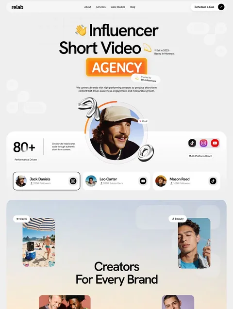

Frequently asked questions
What are the most important homepage design principles?
Say what you do and who it is for in the first screen, offer one primary action, route each kind of visitor to the right page, show named proof, and keep the page fast and readable on a phone.
What is the difference between a homepage and a landing page?
A homepage serves every kind of visitor and routes them to the right page, with full navigation. A landing page serves one audience and one offer, usually from an ad or campaign, and focuses on a single conversion.
What sections should a homepage have?
Most homepages work with a hero, a proof strip, an overview of offers or features, a short how-it-works section, deeper proof such as case studies, a final call to action and a footer with contact details.
How fast should a homepage load?
Google's Core Web Vitals call Largest Contentful Paint good at 2.5 seconds or less, measured at the 75th percentile of page loads. Interaction to Next Paint should be 200 milliseconds or less, and Cumulative Layout Shift 0.1 or less.
Should a homepage use a slider or carousel in the hero?
Usually not. A rotating hero splits attention between several messages and any slide after the first is easy to miss, so one clear headline with one primary action is the safer choice.
Are Waida Studio templates free to use for a homepage?
Yes for the free ones: 26 Framer templates are free with a free Waida account, and Zelda and Medonix are free on every platform. Paid templates are unlocked with a Pro or Ultra plan credit.
A good homepage is clear before it is clever: plain words about what you do, one main action, a section order visitors can predict, proof with names attached, and a page that loads fast and reads well on a phone. Write the headline and section list first, wireframe them, and only then add colour and motion.
To skip the blank page, browse the free Framer templates: 26 of Waida's 41 Framer templates are free with a free account. Paid templates are unlocked with a template credit on Pro, from $12 a month billed yearly, and every licence covers unlimited personal, commercial and client projects.

More from Kazi
Related articles
More in Design Craft
Pricing Page Design: What Works in 2026
How to lay out plans, billing terms, comparison tables and FAQs so visitors can pick a plan without guessing.

About Us Page Design: What Works in 2026
What an About Us page needs, in what order, how to write the story and show the team honestly, and which proof is worth including.
Contact Page Design: What Works in 2026
What a contact page needs, how short the form should be, how to stop spam without puzzles and how to make every field accessible.