Landing Page Design: What Converts in 2026
What separates a landing page that converts from one that doesn't, section by section, with a checklist and examples from Waida's own SaaS templates.
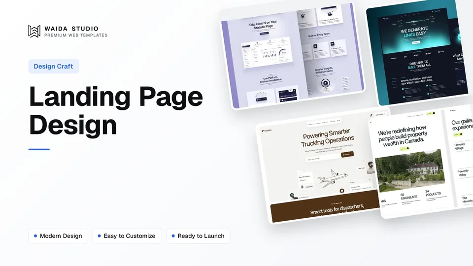
Landing page design that converts comes down to six things done in order: one goal, a hierarchy that guides the eye, a fold that earns the scroll, proof placed where doubt appears, a form with only the fields you need, and a page fast enough on mobile that nobody bounces before they read it. Colour, animation and illustration style matter far less than most teams think.
The Anatomy of a Landing Page That Converts
Every section on the page has one job. When a section does two jobs, or none, conversions drop before you've touched the copy. Use this as a checklist before you write a single headline.
Section | Job | Common mistake |
|---|---|---|
Headline + sub-headline | State who it's for and what changes for them, in one line | A vague tagline that could belong to any product |
Hero visual | Show the product or the outcome, not decoration | A stock photo with no connection to the offer |
Benefits | Translate features into what changes for the visitor | A feature list with no benefit attached to any line |
Social proof | Reduce doubt with logos, numbers or a specific outcome | Proof placed only at the bottom, after doubt already cost you the visitor |
Call to action | One action, repeated, never competing with a second button | Two buttons above the fold, splitting attention |
Form | Ask only what you need to follow up | Asking for budget, phone number and company size before a first reply |
One Goal, One Call to Action
A landing page exists to get one action taken: start a trial, book a demo, download something, or buy. The moment a page offers two of those as equal buttons, it's asking the visitor to make a decision the page should have made for them, and most visitors respond by making neither.
Pick the action that matches where the traffic is coming from. A page linked from a paid search ad for a specific feature should ask for the trial, not the demo; a page linked from a cold outbound email to an enterprise buyer should ask for the call. Everything else on the page, including secondary links in the footer, should stay quiet enough that the primary button is still the obvious next step.
Above the Fold Has to Earn the Scroll
Nobody scrolls past a headline they don't understand. "Built for teams that move fast" says nothing an insurance company's landing page couldn't also claim; "Track expenses across 40 currencies without a spreadsheet" tells a visitor exactly who the product is for and what changes for them.
The hero visual should back up that line, not decorate it. A real product screenshot, a short GIF of the actual interface, or a photo of the actual outcome does more work than an abstract illustration, because it lets a visitor check the claim against something real before they've read another word.
Put Proof Where the Doubt Is
Logos, review scores, a customer count or a specific result work because they answer an objection the visitor is having at that exact moment, not because they look good in a strip near the top. Repeating a short testimonial next to the call to action, rather than only in a dedicated section further down, catches the visitor right before they decide whether to click.
Unbounce's own breakdown of the anatomy of a landing page walks through where proof formats like testimonials, logos and case studies tend to sit on pages that convert, and it's worth a look if you want more teardown examples than fit in this guide.
Every Form Field Costs You a Reply
A form asking for name, work email and company converts more people than one that also asks for phone number, team size, budget and how they heard about you. Each extra field is a fresh reason for someone to close the tab, and most of that information is faster to get on the first call than in a form nobody wants to finish.
If you need to qualify leads before a sales conversation, do it with a shorter form and a follow-up question by email, not by front-loading every field a CRM might eventually want.
Speed and Mobile Aren't Optional
Most landing page traffic arrives from a paid ad or a shared link, which means a large share of it is on a phone with a slower connection than the one the page was built on. A hero video that takes three seconds to start, or a page that shifts layout as fonts load, costs conversions before anyone reaches the offer.
Waida's HTML templates ship as dependency-free code with no framework or build step in between, which keeps the page light by default rather than as an optimisation pass added later. The Next.js and Astro versions of the same templates trade that for a framework's own tooling, so which one to pick depends on whether your team already has a build pipeline.
Waida's SaaS Templates Start From This Structure
Waida Studio's SaaS templates are built as landing pages first: one hero claim, a benefits section, social proof, and a single call to action repeated down the page. For a full side-by-side of the catalogue's Framer options, see Best Framer SaaS & Landing Page Templates for 2026.
Virion, for a straightforward SaaS launch
Virion is a clean, free-on-Framer template built for SaaS startups that want a straightforward hero, benefits and pricing structure without extra sections to strip out.

Lenkrio, for AI products that need to explain a feature set
Lenkrio is a conversion-focused template for AI startups and SaaS companies, free on Framer, with layout built around showcasing several product features without burying the primary call to action.

Trackeo, for a booking or tracking product
Trackeo targets travel SaaS platforms and tracking or booking tools specifically, free on Framer, with sections built for a product that needs to show a workflow rather than a single static feature.

Frequently asked questions
How long should a landing page be?
Long enough to answer every objection a visitor has before they act, and no longer. A page selling a $9 tool can convert in a single screen; a page justifying a five-figure purchase needs more proof and detail. Length should follow the decision, not a template.
How many calls to action should a landing page have?
One goal, repeated. Showing the same button in the hero, after the benefits section and at the bottom of the page is fine, since it's still one action; adding a second, different action splits attention and lowers conversions on both.
What's the difference between a landing page and a homepage?
A homepage has to serve everyone who lands on a site, including existing customers, job applicants and the press. A landing page serves one audience arriving for one reason, usually from a specific ad or link, so it can drop the navigation and stay focused on a single offer.
Should a landing page have full site navigation?
Usually not. A header full of links gives a visitor an easy way to leave before converting. Many high-performing landing pages remove the main navigation entirely, or reduce it to a single link back to the homepage.
Does a landing page need social proof if the product is brand new?
If you don't have customer logos yet, a specific detail, such as who built the product or what problem it solves, does some of the same work. Don't invent a customer count or a testimonial to fill the gap; an honest, specific claim beats a vague one either way.
What makes a landing page convert on mobile specifically?
A fast load, a hero claim that doesn't depend on a large image to make sense, and a form or button that's reachable with one thumb without zooming. Most paid-ad traffic lands on mobile first, so the mobile version is the one that decides the conversion rate.
A landing page converts when it does one job at a time: say who it's for, show it, prove it, and ask for one action. That's true whichever platform builds it, and it's the structure behind Waida's own SaaS templates, free to start on Framer and from $39 on HTML ($49 on Next.js or Astro). Every template comes with a licence covering unlimited projects for one person, with no attribution required.
If the structure fits but the copy and branding don't, template customisation puts your own logo, colours and copy into it. For the full site around the landing page, from pricing to onboarding, see SaaS Website Design: What Converts in 2026, or compare ready-made options in Best Next.js Landing Page Templates for 2026.

More from Kazi
Related articles
More in Design Craft
Portfolio Website Examples: 16 Real Sites and What They Get Right
Sixteen real portfolio websites, checked live today and grouped by discipline, with what to copy from each one.
Agency Website Design: What Wins Clients in 2026
What an agency website needs, in order, to turn visitors into clients, plus template, customisation and custom-build costs.

Best Next.js Landing Page Templates: 9 Picks for SaaS and Startups in 2026
Nine Next.js landing page templates for SaaS products and startups, from designed templates to free open-source starters, with who each one suits.