Contact Page Design: What Works in 2026
What a contact page needs, how short the form should be, how to stop spam without puzzles and how to make every field accessible.
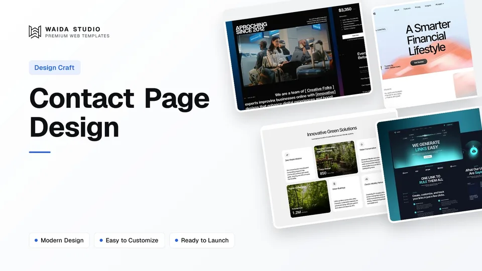
Good contact page design makes it easy to reach the right person in under a minute. Show your direct details (email, phone, address) next to a short form, ask only for what you need to reply, say when you will reply, label every field, and stop spam quietly instead of with puzzles.
What Should a Contact Page Include?
A contact page needs a clear heading, at least one direct way to reach you, a short form, a line saying when you reply and a link to your privacy policy. Location, opening hours, a map and a short FAQ are worth adding when visitors actually need them. The table shows when each element earns its place.
Element | Include when | Notes |
|---|---|---|
Heading and one-line intro | Always | Say who the page is for, e.g. "Questions about an order or a new project? Write to us." |
Email address | Almost always | Make it a mailto: link so it opens the visitor's mail app |
Phone number | When someone answers it | Make it a tel: link; add the hours it is staffed |
Contact form | When you want structured enquiries | Name, email, topic, message; more only if you use it |
Reply time | Always | "We reply within one working day" is enough; only promise what you keep |
Address and map | Shops, clinics, offices people visit | Address as text first; a map is extra, not a replacement |
Opening hours | Local businesses | Keep them identical to your Google Business Profile |
Short FAQ | When the same questions keep arriving | Answer them on the page and fewer messages need a reply |
Privacy policy link | Whenever the form collects personal data | Place it near the submit button |
The page itself should be one click away from anywhere: a Contact link in the top menu, or a button in the header for service businesses, and the same details repeated in the footer. Our website footer design guide covers how to lay those out at the bottom of every page.
How Many Fields Should a Contact Form Have?
Ask for the fewest fields that still let you give a useful reply. For most sites that is four: name, email, a topic and the message. Add a field only when its answer changes what you do next, such as a budget range for a studio that turns down small projects.
A topic dropdown is the most useful field after the message. It lets you route the enquiry and tells the visitor you handle their kind of question. On our own contact page the topic list has six options, from Template Support to Bug Report, and links elsewhere on the site preselect it: the buttons on our customisation page open the form with the topic already set to a custom request.
Split name into first and last only if you need them separately. Make phone optional unless you call people back. Mark the optional fields rather than putting an asterisk on every required one, because a short form where most fields are required reads more simply that way.
- Name: one field, labelled "Your name".
- Email: an email-type input so phones show the @ key and the browser checks the format.
- Topic: a dropdown or a row of options; five to seven choices is plenty.
- Message: a textarea with a hint about what to include, e.g. "Your project, goals and timeline".
- Optional extras: phone, company, budget range, deadline, or "How did you hear about us?"
How to Make a Contact Form Accessible
Give every field a visible label, mark up its purpose so browsers can autofill it, and describe errors in text next to the field. These map to WCAG 2.2 success criteria 3.3.2 Labels or Instructions, 1.3.5 Identify Input Purpose and 3.3.1 Error Identification, all at Level A or AA.
Labels, not placeholders. WCAG's Labels or Instructions criterion (3.3.2, Level A) requires labels or instructions whenever content asks for input. Placeholder text disappears as soon as someone types, so use it as an example of the answer, never as the only label.
Autocomplete values. The Identify Input Purpose criterion (1.3.5, Level AA) lists HTML autocomplete attributes as a sufficient technique. MDN's autocomplete reference gives the tokens: "name", "email", "tel", "organization" and "street-address". With them, browsers can fill the form for a returning visitor.
The right input types. Use type="email" for email and type="tel" for phone, not type="number". MDN's page on tel inputs notes that mobile browsers may show a keypad made for phone numbers, and that the browser does not check the format because phone formats vary so much around the world.
Errors in words. The Error Identification criterion (3.3.1, Level A) asks that the field in error is identified and the error is described in text. "Enter an email address like name@example.com" next to the field beats a red border alone. Keep what the visitor typed when the form reloads.
How to Stop Contact Form Spam Without Puzzles
Start with checks the visitor never sees: a honeypot field and server-side validation. Add an invisible challenge such as Cloudflare Turnstile if spam still gets through. Avoid image puzzles on a contact form; they cost real visitors time and still let some bots past.
Method | How it works | What the visitor sees |
|---|---|---|
Honeypot field | A hidden field humans never fill; submissions that fill it are dropped | Nothing |
Server-side checks | Length limits, a valid email, a minimum message length, rate limits per address | An error only if they type too little |
Invisible challenge (e.g. Turnstile) | A script scores the browser and the server verifies a token | Usually nothing; sometimes a checkbox |
Image or text puzzle | The visitor proves they are human by solving a task | A puzzle, every time |
Our own form uses a honeypot: a field named "website" that is hidden from people and from screen readers, plus length limits on the text fields and a ten-character minimum on the message. That stops most automated junk without adding a single step for real people.
Cloudflare's Turnstile documentation says it can be embedded on any website without sending traffic through Cloudflare, and that it aims to avoid showing a visual or interactive puzzle. Its plans page lists a Free plan with up to 20 widgets and unlimited verification requests.
A note on WCAG: its Accessible Authentication criterion (3.3.8) limits cognitive tests at login, not on contact forms. Puzzles on a contact form are still a barrier for many people, which is reason enough to prefer the quieter methods above.
Email, Phone and Map: Direct Contact Details
Always show at least one way to reach you that does not depend on the form. Some people prefer their own mail app, some forms fail, and a visible email or phone number is a basic sign that a real business is behind the site.
Write the email as a mailto: link and the phone as a tel: link. MDN's anchor element reference explains that mailto: opens the visitor's email program and that a tel: link on a phone dials the number. Write the number with its country code if you take international calls.
For a map, put the full address in text first so people can copy it, then embed the map below. Google's Maps Embed usage and billing page states that Maps Embed usage is available at no charge, though every request needs an API key. A plain link to the address in Google Maps works too and costs nothing to load.
What Happens After Someone Hits Send
The message after the submit button matters as much as the form. Confirm that the message arrived, say when you will reply and give one next step, such as reading a guide or browsing your work. Then route the message to an inbox that someone checks every working day.
- On-page confirmation: "Thanks, we got your message and reply within one working day." Keep the visitor on the site.
- Confirmation email: optional, but useful for support and quotes; include a copy of what they sent.
- Routing: send each topic to the right person or tool, so billing questions do not sit in a sales inbox.
- Testing: submit the form yourself after every launch or redesign; our website launch checklist includes this step.
If you build on Framer, its native forms can send submissions to email or to tools like Google Sheets; our Framer forms guide walks through the setup and the integrations.
Contact Page Layouts by Site Type
Choose the layout by what visitors need from you. Studios and consultants need a qualifying form; SaaS products need to route support away from sales; local businesses need the address, hours and phone above everything else. The sections below are two real examples from our own templates.
- Agency or freelancer: a project form with service, budget and timeline, plus an email for people who skip forms.
- SaaS or app: separate routes for sales, support and press, a link to docs or a help centre, and a short FAQ.
- Local business: address, phone, opening hours and map first; the form is secondary.
- Shop: order help first (shipping, returns, order number field), then general enquiries.
Zelda: a project enquiry form for agencies

Zelda's contact page is a numbered six-step form: name, email, the service needed (website, branding, motion design or front-end development), a budget range, how the visitor heard about the studio, and project details. The page also shows an email address for anyone who would rather write directly.
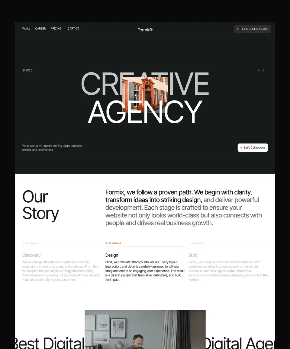
Zelda is free on every platform, including the Figma file, with a free Waida account. It is a fair starting point for any agency website that qualifies leads before the first call.
Finos: details and a short form for a SaaS product

Finos puts email, phone and an office address on one side and a four-field form (first name, last name, email and message) on the other, with only email marked required. Below the form, a six-question FAQ answers billing, data and sharing questions before anyone needs to write in.
Finos is free on Framer; the Webflow version is $59, HTML $39, and Next.js and Astro $49 each.
Templates to start from
All 46 templates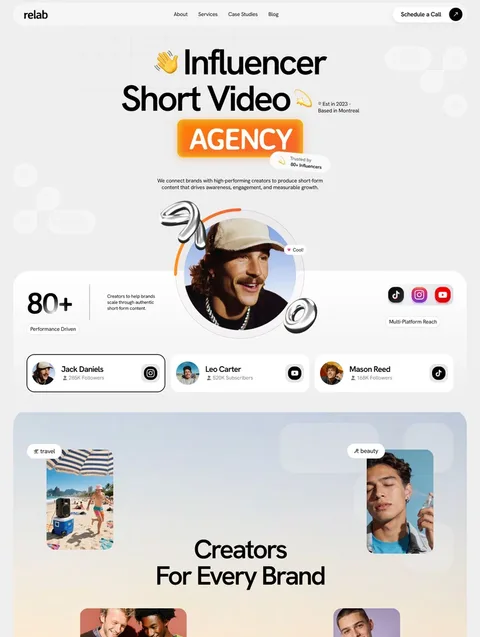

Frequently asked questions
What should be on a contact page?
A heading, at least one direct contact method such as an email link, a short form, the time you take to reply and a privacy policy link. Add an address, opening hours, a map or a short FAQ when visitors need them.
How many fields should a contact form have?
Usually four: name, email, topic and message. Add a field only when its answer changes how you reply, such as a budget range for a studio or an order number for a shop.
Should I use a CAPTCHA on my contact form?
Try invisible methods first: a hidden honeypot field, server-side length and format checks, and rate limits. If spam still gets through, an invisible challenge such as Cloudflare Turnstile usually avoids puzzles for real visitors.
Is it better to show an email address or only a form?
Show both. A form gives you structured enquiries, while a visible email address helps people who prefer their own mail app, works when the form fails and shows that a real business is behind the site.
Can placeholder text replace form labels?
No. Placeholder text disappears as soon as someone starts typing, so it cannot remind them what a field is for. Use a visible label for every field and keep placeholders for example answers.
Do I need a map on my contact page?
Only if people visit you in person. Put the full address in text first so it can be copied, then add an embedded map or a simple link that opens the address in a maps app.
A good contact page is short and honest: direct details, a form with four or five labelled fields, a reply time you keep, spam protection that real people never notice, and a confirmation that says what happens next. Test it yourself after every change; a broken form loses enquiries silently.
Zelda and Finos above both include a contact page you can adapt. Zelda and Medonix are free on every platform, and all of our Framer templates are free with a free account. If you would rather have us set it up, template customisation starts at $499 with 7-day delivery.

More from Kazi
Related articles
More in Design Craft
Website Header Design: What Works in 2026
What belongs in a website header, how to structure the navigation, when a sticky header helps and how to build a mobile menu people can actually use.
Pricing Page Design: What Works in 2026
How to lay out plans, billing terms, comparison tables and FAQs so visitors can pick a plan without guessing.
About Us Page Design: What Works in 2026
What an About Us page needs, in what order, how to write the story and show the team honestly, and which proof is worth including.