About Us Page Design: What Works in 2026
What an About Us page needs, in what order, how to write the story and show the team honestly, and which proof is worth including.
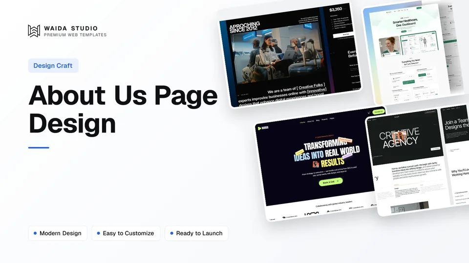
Good about us page design answers three questions fast: what you do, who is behind it and why a visitor should trust you. Open with one plain sentence about what you do, follow with your story, real people, how you work and proof you can back up, then end with one clear next step.
What Should an About Us Page Include?
An About Us page needs a plain statement of what you do, a short origin story, the real people behind the business, how you work, proof you can back up and a way to get in touch. Values, a timeline, press and open roles are worth adding when visitors actually look for them. The table shows when each one earns its place.
Element | Include when | Notes |
|---|---|---|
One-sentence summary | Always | What you do and for whom, in words a stranger understands |
Origin story | Almost always | Why the business exists; a few short paragraphs, not a memoir |
Team or founder | Always, even for a team of one | Real names, roles and photos; a founder note works for small businesses |
How you work | Service businesses | Your process in three to five named steps |
Values or principles | When they change how you behave | Three to five, each with one line on what it means in practice |
Proof | When you have it | Client logos you have permission to show, awards, press, figures you can source |
Location | Local businesses and anyone who meets clients | City or full address; link to your contact page for the rest |
Careers | When you are hiring | Open roles or a line on how to apply |
Next step | Always | One button: book a call, see work, browse products or contact us |
Nielsen Norman Group's study of About Us information on websites found that people expect this content to be clear, authentic and transparent, and that many users struggled to work out what an organisation actually did. The summary sentence at the top is the part most sites get wrong.
How to Structure an About Us Page
Order the page from the quickest answer to the deepest detail: summary, story, people, process, proof, then a call to action. Visitors who only need to confirm you are real stop after the first screen; people weighing a bigger decision keep scrolling, so every section should still make sense on its own.
- Hero: a heading and one or two sentences on what you do and for whom. A photo of the team or the place works better here than an abstract graphic.
- Story: where the business came from and what problem it set out to solve.
- People: founder note or team grid with names, roles and photos.
- How you work: process steps, values or both.
- Proof: client logos, awards, press mentions, numbers with a source.
- Next step: one primary button, repeated contact details in the footer.
Keep the About link visible in the main navigation or the footer on every page. Our homepage design principles cover how the homepage should hand visitors on to pages like this one, and our website footer design guide shows where About usually sits in the footer's link columns.
How to Write Your Story Without Filler
Write the story as specific facts in order: when you started, what you did before, what problem you noticed and what you built to solve it. Dates, places and the names of real things are more believable than adjectives. If a sentence would fit any company, cut it.
Compare "We are a passionate team dedicated to excellence" with "We started in 2019 fitting kitchens in Leeds and now run three crews". The second tells a visitor where you work, how long you have been at it and roughly how big you are. The first tells them nothing.
- Lead with the customer's problem, then how you came to solve it. The story is about why you exist for them.
- Use first person ("we" or "I"). A small business pretending to be a faceless corporation reads as less trustworthy, not more.
- Say what makes you different in one or two concrete points: a speciality, a method, a guarantee, a location.
- Keep it short: three to five paragraphs is enough for most businesses. Link out to case studies or a longer founder note for anyone who wants more.
Our own About Waida Studio page follows this pattern: a one-line summary of what the studio makes, the month it was founded, and a first-person founder note on what Kazi did before and why he started making templates.
How to Show Your Team Honestly
Show real people with real names, roles and photos, and never invent a team to look bigger. Google's guidance on helpful content calls fabricated creator profiles, such as AI-generated headshots, made-up names or false credentials, a form of deception that makes a page untrustworthy.
That warning comes from Google's page on creating helpful, people-first content, in its section on making clear who created the content. A one-person business is better served by a single honest founder note than by a grid of stock photos.
- Photos: consistent framing and lighting across the grid; a plain background is fine. Ask each person before you publish their photo.
- Names and roles: real job titles, not jokes nobody outside the team understands.
- One line each: what this person does for clients, or a link to their LinkedIn profile.
- Alt text: WCAG's Non-text Content criterion (1.1.1, Level A) requires a text alternative for images. For a headshot, the person's name is usually enough when it is not already printed beside the photo.
- Keep it current: remove people who have left. An out-of-date team page tells visitors the site is not looked after.
Proof That Builds Trust (and What to Leave Out)
Use only proof you can back up: client logos you have permission to show, awards you actually won, press that actually ran and numbers you can trace to a source. Leave out anything you cannot verify; NN/g found that visitors compare a company's own claims with third-party reviews before they decide.
Proof type | Use it when | Watch out for |
|---|---|---|
Client logos | You have the client's permission | Logos of companies you never worked for |
Awards and press | You can link to the award page or the article | "As seen in" for a paid listing |
Numbers (years, projects, clients) | You can count them and keep them up to date | Round, inflated figures with a + on the end |
Testimonials | They come from real, named clients who agreed to be quoted | Anonymous praise or reviews you wrote yourself |
Certifications and memberships | They matter in your field (trades, finance, health) | Badges that expire without you noticing |
Links to review profiles | You have reviews on Google, Trustpilot or a marketplace | Picking only the five-star quotes |
A note for template users: every template ships with placeholder numbers, names and quotes so the layout looks finished. Replace each one with your own real figure or delete the block; leaving a demo statistic on a live site is the fastest way to lose a careful visitor's trust.
Should You Add Structured Data to an About Page?
It helps but is optional. Google's Organization structured data lets you state your name, logo, address, contact details and social profiles in a format search engines read reliably. Google's documentation suggests adding it to your home page, says there are no required properties, and recommends adding the ones that apply to you.
The details are in Google's Organization structured data guide, which lists properties such as name, logo, url, sameAs for social and review profiles, address and telephone. Schema.org also defines an AboutPage type you can use to mark the page itself, though it is a description, not a ranking feature.
Whatever you mark up must match what the page and your other profiles say. The same name, address and phone number everywhere is worth more than any single property.
About Us Page Examples From Our Templates
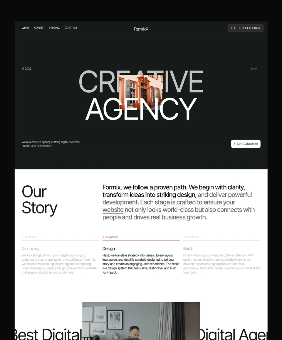
The three About pages below come from our own templates, so treat them as examples of structure rather than neutral picks. Each shows a different approach: a studio that leads with people and process, a SaaS product that leads with mission and team, and an agency that leads with values and method.
Zelda: team, principles and process for a design studio

Zelda's About page opens with a short heading, then a team strip with each person's first name, a one-sentence company summary and five numbered principles such as a client-first approach and a cross-disciplinary team. A four-step How We Work section (Discover, Define, Design, Deliver) and recent blog posts follow.
Zelda is free on every platform, including the Figma file, with a free Waida account. It suits any agency website that sells its people and process.
Medonix: mission, team and partners for a SaaS product

Medonix leads with a mission statement and a founder quote, then a nine-person team grid with names and job titles, a section on where the product operates, investors and partners, and open roles. It is a good model for a SaaS website whose buyers want to know who is behind the software.
Medonix is also free on every platform with a free account, Figma file included.
Mariq: values, method and team for a marketing agency

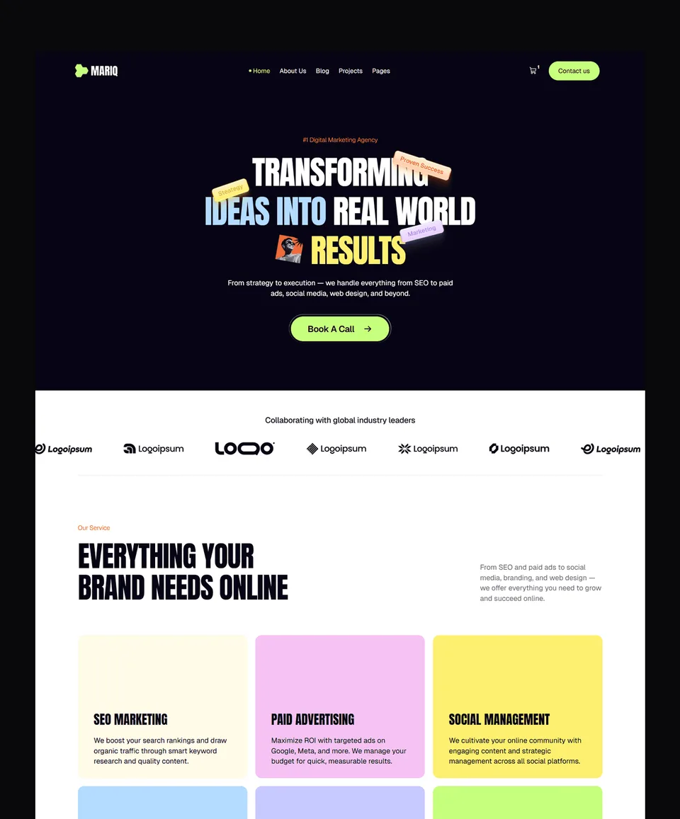
Mariq's About page starts with a one-line summary of the services and a Book A Call button, then animated counters, a values section, the Mariq Method, a team section and an FAQ. Swap the counters for your own real figures before you publish.
Mariq is free on Framer; the Webflow version is $79, HTML $39, and Next.js and Astro $49 each. Its Figma file is $19.
Templates to start from
All 46 templates

Frequently asked questions
What should be on an About Us page?
A plain sentence on what you do and for whom, a short origin story, the real people behind the business, how you work, proof you can back up and one clear next step such as a contact button.
How long should an About Us page be?
Long enough to answer what you do, who you are and why to trust you. For most small businesses that is a short hero, three to five paragraphs of story, a team section and a call to action.
Should a one-person business have an About page?
Yes. A founder note with your name, photo, background and why you started is often more convincing than a team grid, because visitors know exactly who they will be working with.
Should I put stock photos on my About Us page?
Avoid stock photos of people who are not on your team. Use real photos of you, your team or your workplace; Google's guidance treats made-up names and AI-generated headshots as deceptive.
What is the difference between an About page and a Contact page?
The About page explains who you are and why to trust you; the Contact page makes it easy to reach you. Link from About to Contact, and repeat key contact details in the footer.
Does an About Us page help SEO?
Indirectly. It makes clear who is behind the site, which Google's helpful-content guidance encourages, and it is a natural place for consistent name, address and contact details. Organization structured data is optional.
A good About Us page is short, specific and true: one sentence on what you do, a story with real dates and places, real people with names and photos, proof you can link to and one clear next step. Revisit it whenever the team, the numbers or the offer change.
Zelda, Medonix and Mariq above all ship with an About page you can adapt, and every one of our Framer templates is free with a free account. If you would rather have us set it up, template customisation is $499 with 7-day delivery. For the page visitors usually open next, see our contact page design guide.

More from Kazi
Related articles
More in Design Craft
Website Header Design: What Works in 2026
What belongs in a website header, how to structure the navigation, when a sticky header helps and how to build a mobile menu people can actually use.
Pricing Page Design: What Works in 2026
How to lay out plans, billing terms, comparison tables and FAQs so visitors can pick a plan without guessing.
Contact Page Design: What Works in 2026
What a contact page needs, how short the form should be, how to stop spam without puzzles and how to make every field accessible.