Website Fonts: How to Choose and Pair Them in 2026
How to choose, pair, size, license and load website fonts, with the real pairings used in six live templates.
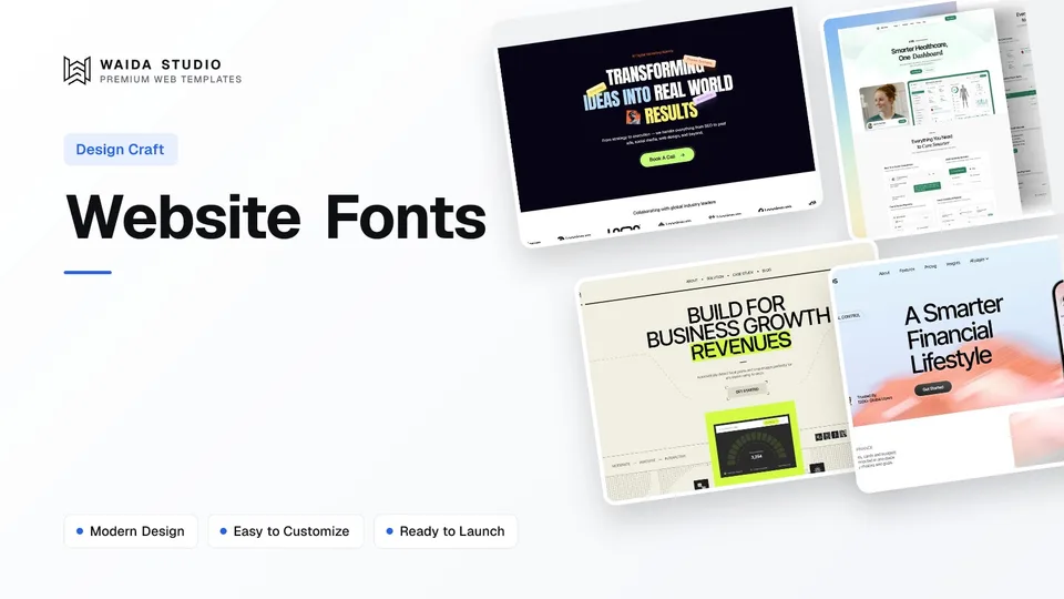
Good website fonts come down to five decisions: use one or two families, pair a distinctive heading face with a plain body face, set body text at 16–18px with a line height near 1.5, check the licence covers web use, and load WOFF2 files with a sensible `font-display` value.
This guide covers each of those decisions with checkable numbers. Where it names fonts, they are ones we found today in the CSS of live Waida Studio templates, so you can open the demos and see the pairings at real sizes rather than on a specimen sheet.
How Many Fonts Should a Website Use?
Most websites need one or two font families. One family with several weights is the safest choice for product, SaaS and business sites. Two families give you contrast, usually a display or serif face for headings and a neutral sans for everything else. A third family is rarely worth the extra download.
Count families, not files. A family such as Inter Tight can ship as a single variable font that covers every weight, while a static family ships one file per weight and style. Every extra family adds requests and more chances for text to shift as fonts arrive.
Setup | When it works | Watch out for |
|---|---|---|
One family, 2–4 weights | SaaS, startups, dashboards, most business sites | Headings that look too close to body text; fix it with weight and size, not a second font |
Two families (display + text) | Agencies, portfolios, brands with a personality | A display face used for long paragraphs |
Two families (sans + serif accent) | Clinics, consultancies, editorial pages | Accent text that is too small to read in the serif |
Three or more | Rarely; an icon or mono face for code samples | Page weight and layout shift |
Font Pairing: What Actually Works
A pairing works when the two faces differ clearly in one way and agree in another. The usual difference is width, weight or classification (serif against sans). The usual agreement is proportion: similar x-heights so the two sit comfortably on the same line. If you can't name the difference, use one family.
These are the pairings in six Waida templates, read today from the CSS of their live HTML builds:
Template | Headings | Body | Pattern |
|---|---|---|---|
Mariq | Anton | Geist | Condensed display + neutral sans |
Medonix | Inter Tight | Inter Tight, with Lora for accent text | One sans + serif accent |
Avande | Inter Tight | Inter Tight, with Stack Sans Notch as a third face | One family + display accent |
Finos | Inter Tight | Inter Tight | One family, weight contrast |
Inter | Inter | One family, weight contrast | |
Zelda | Creato Display | Creato Display | One family, light to medium weights |
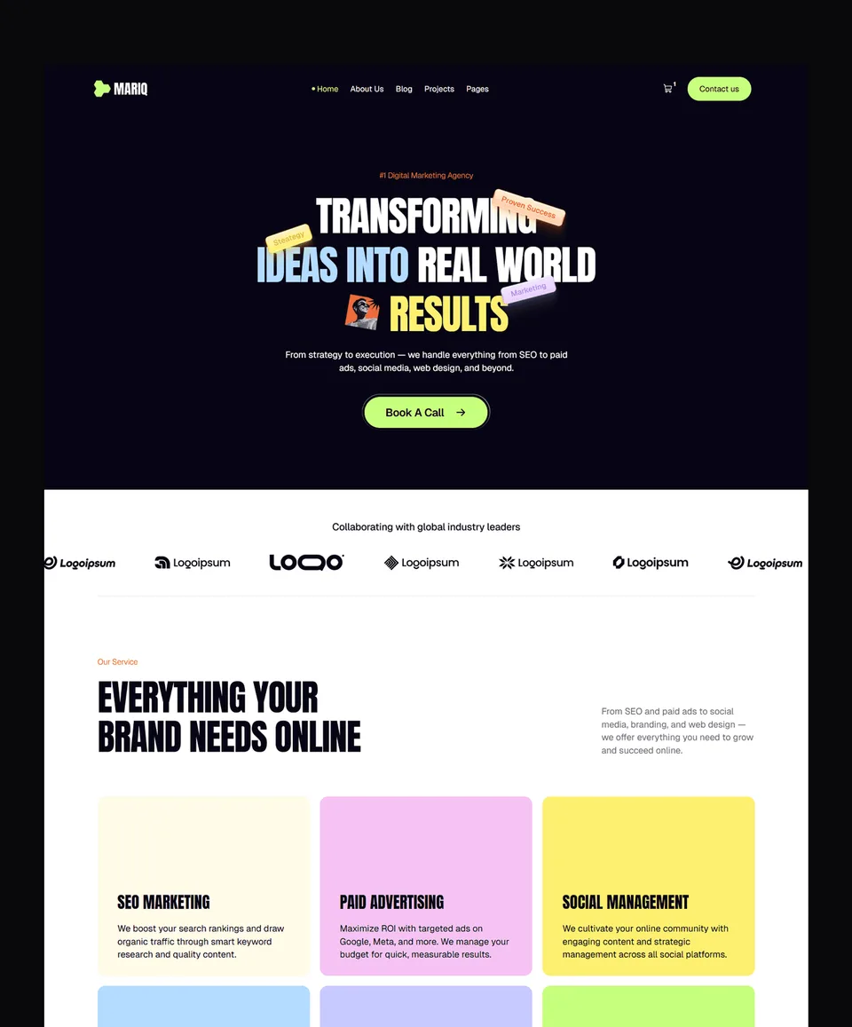
Mariq shows the two-family pattern at its clearest. Anton is a tall, condensed display face classified as Display on Google Fonts, so it only appears in large headings. Geist, a plain sans, handles every paragraph, button and label. Medonix does the opposite: one sans does almost everything, and a serif appears only on a few highlighted words.
- Keep the display face big. Condensed and decorative faces lose legibility below about heading size.
- Give the body face the boring job. It should be readable at 16px on a cheap phone screen, in every weight you use.
- Test real copy. Your longest headline and a 60-word paragraph tell you more than a pangram.
- Check the characters you need. Currency symbols, accented names and numerals in tables vary between fonts.
Font Size, Line Height and Line Length
Set body text at 16–18px, line height around 1.5, and lines of no more than about 80 characters. Those figures come from accessibility guidance and match what the Waida templates ship: Medonix sets its default paragraph at 16px, and Mariq sets its default text at 18px.
Setting | Starting point | Source or reason |
|---|---|---|
Body size | 16–18px (1rem–1.125rem) | Set sizes in rem so text scales with the reader's browser settings |
Line height (body) | 1.4–1.6 | WCAG 1.4.12 requires layouts to survive 1.5 |
Line height (headings) | 1.0–1.2 | Large text needs less leading |
Line length | Up to 80 characters | WCAG 1.4.8 (AAA) sets 80 characters, 40 for CJK |
Paragraph spacing | At least 1× the font size | WCAG 1.4.12 tests 2× without content breaking |
Alignment | Left-aligned, not justified | WCAG 1.4.8 asks for text that is not justified |
The text spacing criterion is Level AA, and it is about resilience rather than defaults: your design doesn't have to use line height 1.5, letter spacing 0.12em and word spacing 0.16em, but nothing may be clipped or overlap when a reader applies them. Fixed-height buttons and cards with tight text are where this usually fails.
Headings follow the same logic. Your hero headline can be large and tightly set, but test it at mobile width with the longest wording you plan to use; our hero section design guide covers headline length in more detail.
System Fonts, Google Fonts or Self-Hosted?
System fonts cost nothing to load, Google Fonts are the easiest hosted option, and self-hosting gives you control over files and caching. Many sites use a system stack (`system-ui, sans-serif`) for body text and one hosted face for headings, which is a pattern web.dev suggests.
- System fonts (`system-ui`): no download, and the text looks native on each device. The trade-off is that it looks different on Windows, macOS and Android.
- Google Fonts API: link a stylesheet and the files come from Google's servers. web.dev's font guide recommends a `preconnect` to fonts.googleapis.com and a second one, with `crossorigin`, to fonts.gstatic.com.
- Self-hosted: you serve the WOFF2 files from your own domain. web.dev notes the speed gain is not guaranteed, so test it, and apply the subsetting and compression a provider would otherwise do for you.
The Waida HTML builds we checked self-host their fonts: Medonix, Mariq and Avande load WOFF2 files from the same domain, each declared with `font-display: swap`.
Font Licences: What You Can Do With a Free Font
Check that the licence covers web embedding before you upload a font anywhere. Most Google Fonts use the SIL Open Font License, which lets you use, embed and redistribute the font in commercial work. The one thing it forbids is selling the font files on their own.
All five Google families in the table above (Inter, Inter Tight, Lora, Anton and Geist) are listed as OFL in the google/fonts repository, which is also where each font's licence file lives. The OFL text adds a few conditions: keep the copyright notice and licence with the font files, and don't release a modified version under a reserved font name.
Commercial fonts are different: a desktop licence does not automatically cover embedding the font on a website, so read the licence for the exact use you have in mind. Webflow's own help article on uploading fonts tells you to confirm you have permission before uploading.
Loading Fonts Fast: WOFF2, font-display and Subsetting
Serve WOFF2, load only the weights and character sets you use, and choose a `font-display` value on purpose. Fonts are often among the largest files a template downloads, and a late font causes either invisible text or a visible jump when it swaps in.
WOFF2 is the format to use: web.dev reports it compresses about 30% better than WOFF and has the widest browser support. The `font-display` descriptor decides what happens while the file is still downloading:
Value | Behaviour | Good for |
|---|---|---|
`swap` | Fallback text shows almost at once; the web font replaces it whenever it arrives | Headings and brand text that must use the font |
`fallback` | Short invisible period, then fallback; the font swaps in only if it arrives within a short window | A middle ground for body text |
`optional` | Fallback shows; the font is used only if it is already available, so there is no swap | Body text when layout stability matters most |
`block` | Text stays invisible for a short time, then the font swaps in whenever it loads | Icon fonts, which are better replaced with SVG |
`auto` | The browser decides | Leaving it to the browser |
The behaviours above follow MDN's font-display reference. Two more techniques cut layout shift: subsetting, so a page downloads only the Latin or Cyrillic glyphs it needs via `unicode-range`, and the `size-adjust` descriptor, which scales the fallback font to match the web font's proportions.
Adding Fonts in Framer and Webflow
Both builders include Google Fonts out of the box and accept uploaded fonts, and both recommend WOFF2. The difference is where you do it: Framer uploads through the font picker on a text layer, while Webflow uploads in Site settings.
Framer | Webflow | |
|---|---|---|
Built-in libraries | Google Fonts and Fontshare in the font picker | Google Fonts and Adobe Fonts integrations in Site settings > Fonts |
Uploading | Select a text layer, open the font picker, Custom tab, Upload Fonts | Site settings > Fonts > Custom fonts |
Recommended format | WOFF2 | WOFF2 (also accepts WOFF, TTF, OTF, EOT, SVG; 4MB per file) |
Automatic optimisation | Converts to WOFF2, splits subsets, `swap` with size-matched fallbacks | Creates fallback fonts for uploaded families |
Paid plan needed to upload | Not stated | No |
Sources: Framer's help articles on adding custom fonts and how fonts are optimised, and Webflow's article on uploading custom fonts. One Webflow gotcha: if you upload a font that shares a name with a Google font, such as Montserrat, rename it or Webflow may keep loading Google's copy.
If your fonts come from a design file, set them up before you rebuild the layout; our guide to moving from Figma to Framer covers which fonts need uploading after you paste.
Templates With the Typography Already Set
A template saves you the pairing and sizing work, because the type scale is already tested across breakpoints. These four are Waida Studio's own templates, so treat them as our picks rather than a neutral review. Each is free on Framer with a free Waida account.
Mariq: Anton and Geist

Mariq is an 11-page template that uses Anton for headings and Geist for body text, a clear example of a condensed display face paired with a quiet sans. It is free on Framer, $79 on Webflow, $39 as HTML and $49 for Next.js or Astro.
Medonix: Inter Tight with a Lora accent

Medonix is a 13-page SaaS and business template that runs on Inter Tight throughout, with Lora reserved for accent text. It is free on every platform, and its Figma file is free too.
Avande: Inter Tight with a display accent

Avande is a 16-page agency template that sets headings and body in Inter Tight and adds Stack Sans Notch as a third, decorative face. It is free on Framer, $99 on Webflow, $39 as HTML and $49 for Next.js or Astro.
Finos: one family, weight contrast

Finos is a 15-page SaaS template that uses Inter Tight for everything and builds hierarchy from size and weight alone. It is free on Framer, $59 on Webflow, $39 as HTML and $49 for Next.js or Astro.
Swapping a template's fonts is usually a style-level change in Framer or Webflow, but recheck headings, buttons and navigation afterwards, because a wider font can push text out of fixed boxes. If you'd rather not, our customisation service starts at $499.
Templates to start from
All 46 templates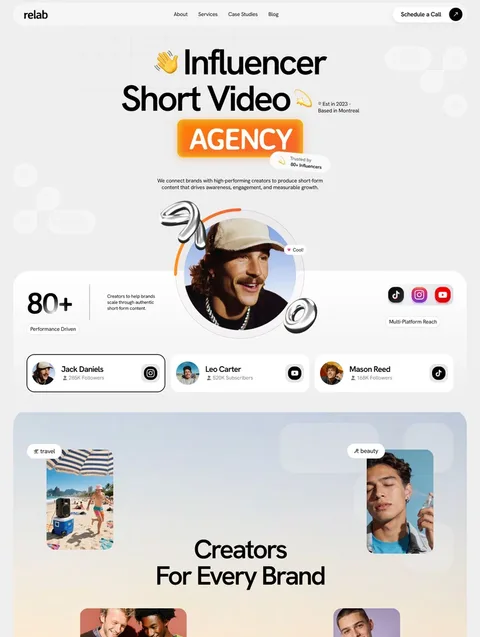


Frequently asked questions
What is the best font for a website?
There is no single best font. For body text, choose a plain, well-hinted sans such as Inter or Geist, or a system font stack; for headings, choose a face that suits the brand and stays readable at large sizes.
How many fonts should a website use?
One or two families. One family with several weights suits most business and SaaS sites; two give contrast between headings and body text. A third family rarely justifies the extra download and layout shift.
What font size should body text be on a website?
Use 16–18px for body text, set in rem so it scales with the reader's browser settings, with a line height around 1.5 and lines of no more than about 80 characters.
Are Google Fonts free for commercial websites?
Most are. Google Fonts families are mainly released under the SIL Open Font License, which allows commercial use and embedding on websites but forbids selling the font files on their own. Check each font's licence file to be sure.
Which font format should I use on a website?
Use WOFF2. It compresses better than WOFF, TTF or OTF and works in all modern browsers, and both Framer and Webflow recommend it for uploaded fonts.
What does font-display: swap do?
It shows text in a fallback font almost immediately and replaces it with the web font whenever that file finishes loading. Text is never invisible, but a late font can cause a visible jump.
Pick one or two families, give the body face 16–18px and room to breathe, confirm the licence allows web use, and serve WOFF2 with a deliberate `font-display` value. Then test your real headlines on a phone before you publish; our website launch checklist has the rest of the pre-launch checks.
If you want a tested type system to start from, browse the Framer templates, where many are free with a free account, or the Webflow templates. Paid templates are also included in Pro, from $12 a month billed yearly.

More from Kazi
Related articles
More in Design Craft
Website Wireframe Examples: How to Wireframe a Site in 2026
Six website wireframe examples you can copy block by block, with a seven-step method for drawing your own and a plain comparison of the tools.
Hero Section Design: What Works in 2026
A practical guide to hero section design: what the first screen must say, which layout to pick, and how to keep images, video and text fast and readable.
One Page Website Design: What It Needs in 2026
A practical guide to one page website design: when one page is enough, which sections it needs, how the navigation works and where it falls short for SEO.