One Page Website Design: What It Needs in 2026
A practical guide to one page website design: when one page is enough, which sections it needs, how the navigation works and where it falls short for SEO.
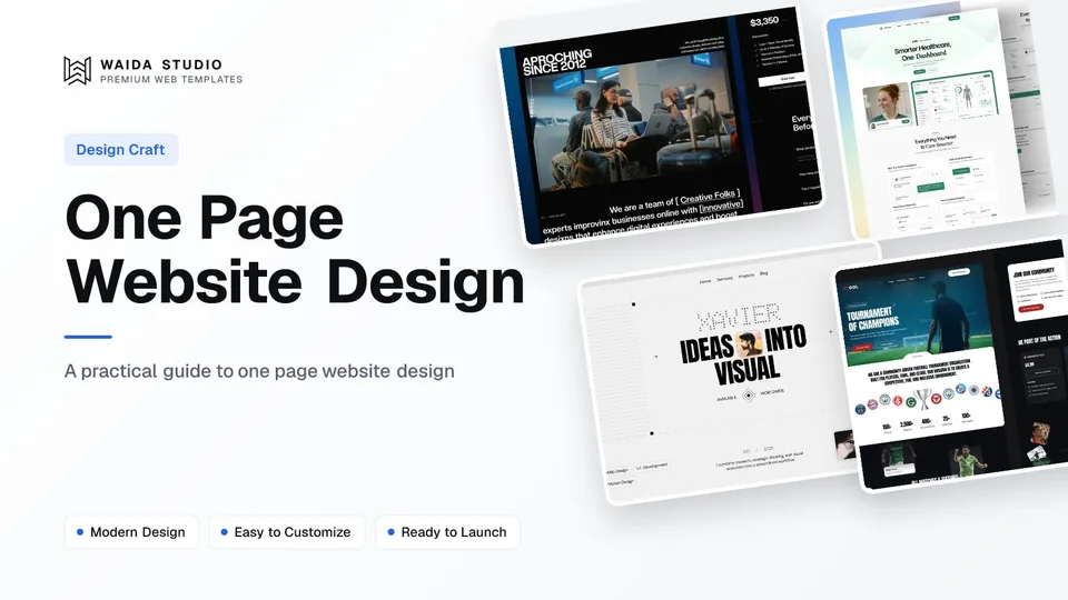
A one page website puts everything on a single scrolling page: hero, offer, proof, pricing, FAQ and contact, with menu links that jump to each section. It suits a single product, service or person with one main action. Good one page website design comes down to section order, navigation that works, and accepting that one URL can rank for only one main topic.
What Is a One Page Website?
A one page website is a complete site that lives on one URL. The menu does not open new pages; each item scrolls to a section further down the same page. Apart from legal pages such as a privacy policy, there is nothing else to click through to.
It is easy to confuse with a landing page, and the two look alike. The difference is the job. A landing page serves one campaign and often hides the menu so nothing distracts from the call to action; our guide to landing page design covers that format. A one page website is the whole site for a business or person, so it keeps a menu, answers the questions a new visitor has, and still works when someone arrives from a search, a business card or a social profile.
When One Page Is Enough
One page is enough when you have one offer, one audience and one action you want visitors to take, and the full story fits in a few minutes of scrolling. Once you have several services that people search for separately, a blog, or content that changes every week, you need more pages.
Situation | One page works | Use more pages |
|---|---|---|
Offer | One product, service or event | Several services searched for separately |
Content | Fits in 6–10 sections | Case studies, docs or a blog |
Updates | A few times a year | Weekly posts or listings |
Search | People search for your name or one topic | You want to rank for many different queries |
Action | One: book, buy, sign up or contact | Several paths for different audiences |
Typical good fits are a freelancer or personal portfolio website with a handful of projects, a product launch or waitlist, an event, a local business with one service, and an app that needs a home before it needs documentation.
The Sections a One Page Website Needs
Most one page sites need the same eight to ten sections, in roughly this order, because each one answers the next question a new visitor has. Keep the order and cut sections you have nothing real to put in, rather than padding them.
- Navigation: a short menu of four to six section links, plus one button for the main action.
- Hero: what you do, for whom, and the main button, all readable without scrolling.
- Proof: client logos, numbers you can back up, or a short line of press mentions.
- Offer: the service or product features, written as outcomes for the visitor.
- Work or how it works: three to six projects, or the steps from first contact to result.
- Pricing: a price or a starting price, if you can publish one.
- Testimonials: two or three real quotes with a name and role.
- FAQ: the four to six questions people ask before they buy.
- Contact: a short form, email or booking link, repeated as the final call to action.
- Footer: legal links, social profiles and a link back to the top.
Because everything shares one scroll, the page needs clear section breaks. Alternate backgrounds or generous spacing help the eye see where one section ends, and a heading at the top of each section tells a skimming visitor what is there.
Navigation and Anchor Links
Menu items on a one page website are anchor links: each points to an ID on the same page, such as #pricing, and the browser scrolls there. MDN's reference for the HTML anchor element shows the pattern, and notes that #top links back to the top of the page.
In Framer you name a scroll section on the frame, then choose that page and section in a link's settings; Framer's help article on adding a scroll-to-top button walks through the same steps. In HTML, Next.js or Astro you give each section an id and point the link at it.
Three details separate a menu that works from one that annoys:
- Fixed headers hide headings. A sticky menu covers the top of the section you jump to. Setting scroll-padding on the page to the header's height fixes it; MDN lists it as widely available since April 2021.
- Smooth scrolling is a choice, not a default. scroll-behavior: smooth animates the jump. Turn it off for visitors who ask their device for less motion with prefers-reduced-motion.
- Mobile menus must close. After a tap on a section link, the open mobile menu should close, or the visitor lands on the right section with the menu still covering it.
SEO on a Single Page
A one page website can rank, but for fewer searches than a multi-page site. One URL has one title tag and one meta description, so it competes well for your name and one main topic and poorly for everything else. Sections do not count as separate pages in search results.
Google's own URL structure guidelines say Google Search generally doesn't support URL fragments, so yoursite.com/#pricing is not a separate result. If you need to rank for three services in three cities, give each service its own page.
What you can do on one page:
- Use one H1 for the main topic, and an H2 at the top of every section.
- Write the title tag and meta description around the one query that matters most, usually your name plus what you do.
- Keep the page fast. A long page tends to carry many images, so compress them and lazy-load everything below the hero. Google's Core Web Vitals targets are LCP within 2.5 seconds, INP of 200 milliseconds or less and CLS of 0.1 or less, measured at the 75th percentile of visits.
- Add the FAQ as real text on the page, not inside an image or a closed widget.
If the site runs on Framer, our Framer SEO guide covers the platform's title, description and sitemap settings.
Common One Page Design Mistakes
Most one page sites fail in the same few ways: too many sections, a menu that lists every one of them, and a call to action that appears once and only at the bottom. Each is easy to fix before launch.
Mistake | Fix |
|---|---|
Twelve or more sections | Merge or cut to the 8–10 a visitor needs |
A menu link for every section | Link only the 4–6 sections people look for |
One call to action, at the end | Repeat the main button after the hero, pricing and FAQ |
Heavy animation on every block | Animate a few key moments and respect reduced motion |
Contact form with eight fields | Ask for name, email and one question |
No way back up | Add a back-to-top link in the footer |
Before going live, run through a website launch checklist: the anchor links, the form and the mobile menu are the parts that break most often on a single page.
Starting from a Template
The fastest route is to start from a template's home page, which is already a one page site in miniature. Waida Studio does not sell one-page-only templates; every template ships with at least seven pages. You keep the home page, point the menu at its sections, and remove the inner pages you don't need.
The Waida sections library lets you copy individual sections such as an FAQ, pricing table or contact block from our templates into Framer, Webflow or Figma, which is useful when the home page is missing one. Every free account gets a free set of sections; Pro and Ultra unlock all of them. These three Waida templates have home pages that already follow the order above:
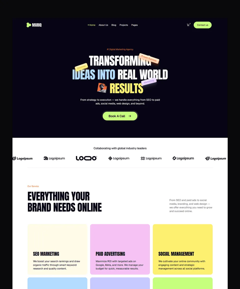
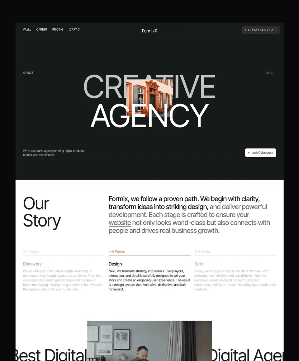
Zelda: dark agency template

Zelda's home page runs from a bold dark hero through projects and services to contact, which is the one page structure for a studio or freelancer. It is free on Framer, Webflow, HTML, Next.js and Astro with a free Waida account, and its Figma file is free too.
Medonix: SaaS product template

Medonix's home page covers positioning, features, social proof and calls to action, the order a product page needs. It is also free on every platform with a free account, including the Figma file.
Xavier: personal portfolio template

Xavier is an editorial personal portfolio with case studies, services, pricing and contact. It is free on Framer with a free Waida account; the Webflow version is $79 and the HTML version $39.
Templates to start from
All 46 templates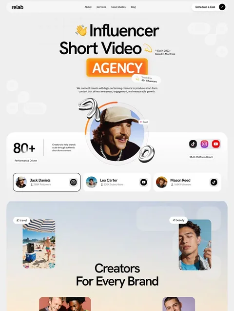


Frequently asked questions
Is a one page website good for SEO?
It can rank well for your name and one main topic, because the whole site shares one title tag and one URL. It ranks poorly for many separate queries, since Google generally treats sections as part of the same page rather than separate results.
What is the difference between a one page website and a landing page?
A one page website is the whole site for a business or person and keeps a menu to its sections. A landing page serves one campaign, often hides the menu, and usually sits alongside other pages on a larger site.
How many sections should a one page website have?
Most need eight to ten: navigation, hero, proof, offer, work or process, pricing, testimonials, FAQ, contact and footer. Cut any section you have nothing real to put in rather than padding it.
How do I link a menu item to a section on the same page?
Give the section an ID and point the link at it with a hash, such as #pricing. In Framer, name a scroll section on the frame and choose it in the link settings.
Can I turn a multi-page template into a one page website?
Yes. Keep the template's home page, point the menu items at its sections instead of other pages, and remove the inner pages you don't need. Copy in any missing section, such as pricing or an FAQ.
A one page website works when you have one offer, one audience and one action. Put the sections in the order a visitor's questions arrive, keep the menu short, make the anchor links land cleanly under the header, and accept that the page will rank for your name and one main topic rather than many.
To start, browse the Framer templates: 39 in total, 24 of them free with a free account, and paid ones from $49 to $99. The Pro plan is $12 a month billed yearly and adds unlimited sections, and if you would rather hand the work over, our customisation service starts at $499.

More from Kazi
Related articles
More in Design Craft
Website Wireframe Examples: How to Wireframe a Site in 2026
Six website wireframe examples you can copy block by block, with a seven-step method for drawing your own and a plain comparison of the tools.
Hero Section Design: What Works in 2026
A practical guide to hero section design: what the first screen must say, which layout to pick, and how to keep images, video and text fast and readable.
Website Launch Checklist: What to Check Before You Go Live in 2026
Everything to check before and after a website goes live: copy, forms, mobile layouts, Core Web Vitals, contrast, noindex, sitemaps, redirects, domain and analytics.