Website Wireframe Examples: How to Wireframe a Site in 2026
Six website wireframe examples you can copy block by block, with a seven-step method for drawing your own and a plain comparison of the tools.
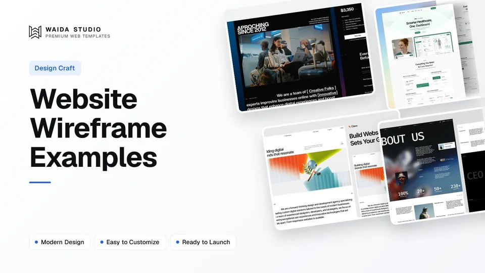
A website wireframe is a grey-box plan of a page: which blocks appear, in what order, and what each one says. The website wireframe examples below cover six common pages, from an agency homepage to a product page, followed by a seven-step method, mobile rules and the tools worth using.
What Is a Website Wireframe?
A wireframe is the structure of a page before any visual design. Balsamiq calls it "the skeleton of your digital project", and its guide to wireframes says a wireframe focuses on layout and content placement, not colour, fonts or polish.
Figma's wireframing guide describes wireframes as basic blueprints that help teams agree on requirements. That is the real job: getting you, a client or a developer to agree on what goes on the page before anyone spends hours on how it looks.
A wireframe answers three questions for each page. What must a visitor understand? What should they do next? Which content proves the point? If the wireframe answers those, the visual design has a firm base. If it doesn't, no amount of styling will fix the page.
Low-Fidelity vs High-Fidelity Wireframes
Low-fidelity wireframes are rough boxes and labels for agreeing on layout and order; high-fidelity wireframes add real copy, spacing and sometimes type and colour. Start low, because changes are cheap there, and move up only once the structure stops changing. Most small sites need one round of each.
Low fidelity | High fidelity | |
|---|---|---|
Looks like | Grey boxes, labels, crossed image placeholders | Close to a finished page, often without final images |
Content | Headlines in draft, short notes on each block | Real headlines, button labels and section copy |
Typography and colour | None, or one neutral font | Often the real type scale; colour optional |
Made with | Paper, Balsamiq, Whimsical, a Figma frame | Figma, or a template's design file |
Best for | Agreeing page order and content with a client | Handing a clear spec to whoever builds the site |
Time per page | Minutes | Hours |
Figma's guide draws the same line: low-fidelity wireframes focus on layout, navigation and information architecture, while high-fidelity ones look like early mockups. Balsamiq adds a useful tip for both levels: use real content early, because a rough real headline grounds a layout better than placeholder text.
Wireframe, Mockup or Prototype?
A wireframe shows structure, a mockup shows the finished look as a still image, and a prototype lets you click through the pages. They are stages, not alternatives. Many small projects skip the separate mockup and go straight from wireframe to a styled template.
Stage | What it shows | What you test with it |
|---|---|---|
Wireframe | Blocks, order, hierarchy, draft copy | Does the page say the right things in the right order? |
Mockup | Colour, type, images, final spacing | Does it look like the brand and feel trustworthy? |
Prototype | Clickable links, flows and states | Can people find things and finish a task? |
Wireflow | Wireframes joined by arrows for each action | Does a multi-step flow, such as checkout, make sense? |
The last row comes from Nielsen Norman Group, whose article on wireflows describes them as wireframe-style page layouts combined with a simple flowchart of the interactions. Use one when a single page changes state a lot, such as a cart, a booking form or a dashboard.
Six Website Wireframe Examples by Page Type
Each example below lists a page's blocks from top to bottom, which is exactly what a low-fidelity wireframe records. Draw each line as a box, label it, and you have a working wireframe. Where an example is based on one of our own templates, we name it, so you can open the finished page and compare.
1. Agency or Studio Homepage
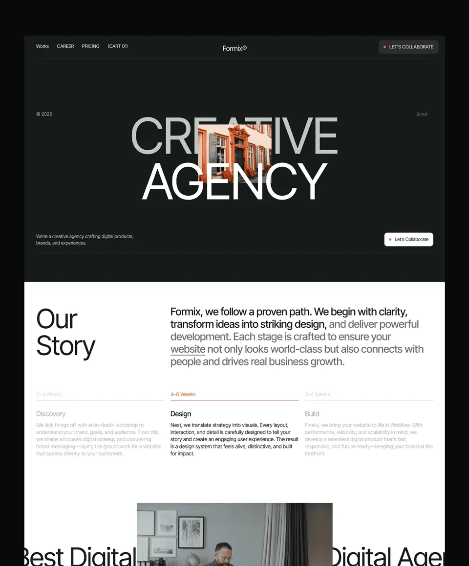
This is the order used on the home page of Zelda, our free design agency template: a bold hero, then selected projects, then services, then contact. It works because a studio's work is its best argument, so the projects come before any claims about the studio.
- Navigation: logo, Work, Services, About, Contact button
- Hero: one-line positioning statement, short supporting line, one button
- Selected projects: three to six project cards with client name and outcome
- Services: three or four services, one sentence each
- Contact: short prompt, button or form, email address
- Footer: links, social profiles, legal pages
2. SaaS Product Homepage
Medonix, our free medical SaaS template, follows this pattern: positioning, features, social proof, then calls to action. Notice the button repeats at the end, because a visitor who scrolls the whole page has earned a second chance to act.
- Navigation with a Sign in link and a primary Start trial or Book demo button
- Hero: what the product does, for whom, plus a product screenshot box
- Logo row of customers (only real ones)
- Three feature blocks, each with a short heading, a sentence and a screenshot box
- Testimonials or a short case study
- Pricing teaser linking to the pricing page
- Final call to action repeating the hero button
- Footer
3. Personal Portfolio Homepage
A portfolio wireframe should get to the work fast. Xavier, our personal portfolio template, is built around case studies, services, a blog, pricing and contact; the list below puts the work near the top. Our guide on how to design a portfolio website covers the content side.
- Name and one line on what you do and for whom
- Three to five case study cards, each with a result in one line
- Short about block with a photo placeholder
- Services or what you can be hired for
- Contact button and email
4. E-commerce Product Page
Product pages have more states than other pages, which makes them a good place for a wireflow. Deux, our bakery template, pairs product pages with a cart that offers pickup or delivery at checkout; wireframe the product page and each cart step as separate frames joined by arrows.
- Breadcrumb: Shop / Category / Product
- Image gallery box on one side, product name, price and options on the other
- Quantity and Add to cart button, with a note on delivery or pickup
- Description, ingredients or specifications
- Reviews (only real ones) and related products
- Second frame: cart drawer with items, total and Checkout button
5. Contact Page
A contact page wireframe is short, but every field needs a reason to exist. Keep the form to what you need to reply, and say how fast you reply. If you build on Framer, our Framer forms guide covers where submissions go and how spam protection works.
- Heading and one line on what to contact you about
- Form: name, email, message, plus one or two qualifying fields such as budget or service
- Response time and alternative contact (email, phone, address)
- Map or service area box, only if location matters to the business
6. Blog Article Page
Article pages are mostly text, so the wireframe is about reading order and what surrounds the text. Wireframe one article with real headings rather than placeholders, because heading length changes the layout more than anything else on the page.
- Title, author, date and a cover image box
- Short introduction that answers the question in the title
- Body with H2 sections, a table or image box where needed
- Author box, related articles and a newsletter or product prompt
How to Wireframe a Website in Seven Steps
To wireframe a website, list your pages, decide the goal of each, write draft copy, then draw boxes in order for mobile and desktop. Review with the people who must approve it before adding any styling. These seven steps take a small site from a blank page to an agreed plan.
- List every page. Write a simple sitemap: Home, About, Services, Work, Contact, and any templates such as a blog post or product page.
- Give each page one goal. "Book a call" or "Start a trial" is a goal; "tell people about us" is not.
- Write the headlines first. A draft headline and button label for each block, in plain words. Balsamiq's advice to use real content early applies here.
- Order the blocks. Put what a visitor needs to decide first at the top. Our hero section guide covers the first screen in detail.
- Draw the mobile version. Stack the blocks in one column and check that nothing important falls far down the page.
- Add the desktop version. Decide where blocks sit side by side, and keep the same order as mobile.
- Review and change. Walk the client or your team through each page with the goal in mind. Figma's guide puts it well: don't get too attached to your wireframe.
If the site is a single long page, the steps are the same but every section becomes a block on one canvas; our guide to one-page website design covers section order and anchor links.
Wireframing for Mobile
Wireframe the mobile layout as its own frame, not as an afterthought, because Google indexes the mobile version of a page. Plan for one column, short blocks and tap targets large enough to hit with a thumb. A desktop wireframe squeezed into a phone frame usually hides something important.
Google's mobile-first indexing guide says it uses the mobile version of a site's content, crawled with the smartphone agent, for indexing and ranking. So anything you cut from the mobile wireframe is content search engines may never see. Keep the same content on both, and change only the layout.
- Targets: WCAG 2.2's target size rule asks for pointer targets of at least 24 by 24 CSS pixels, or enough spacing around smaller ones. Draw buttons and menu links at a realistic size.
- Navigation: decide what the mobile menu holds and whether the main button stays visible outside it.
- Tables and side-by-side blocks: decide how they stack or scroll on a narrow screen.
- Forms: one field per row, with labels above the fields.
Website Wireframing Tools Compared
You can wireframe with paper, Balsamiq, Whimsical or Figma; the right tool is the one your team will actually review in. Paper is fastest for a first pass, Balsamiq and Whimsical keep things deliberately rough, and Figma suits teams who will take the same file all the way to a finished design.
Tool | Best for | Price (checked 13 November 2026) |
|---|---|---|
Paper and pen | First sketches, client workshops | Free |
Deliberately sketchy low-fidelity wireframes | From $16 per editor a month billed yearly ($23 monthly), up to 10 projects; 14-day free trial | |
Quick wireframes and wireflows next to flowcharts | Free plan with 50 board objects a month; Pro $10 per editor a month billed yearly ($12 monthly) | |
Wireframes that become the final design | Free Starter plan with unlimited drafts and UI kits; paid seats for teams |
Whimsical's pricing page also lists AI wireframes that turn a text prompt into editable wireframes. Treat any generated layout the same way as a template: a starting point you still check against your page goals and your real content.
From Wireframe to Finished Site With a Template
A template can replace the high-fidelity stage: pick one whose page order already matches your wireframe, then swap in your copy. Every Waida Studio template has a Figma design file, so you can rearrange sections in Figma first and build on Framer, Webflow, HTML, Next.js or Astro afterwards.
Compare your wireframe with a template's page list block by block. If most blocks match, a template saves the visual design stage entirely. If your wireframe needs a section the template lacks, note it; a single new section is a small job, while a different page structure means a different template. Our guides to Figma to Framer and Figma to Webflow cover the handover.
These two are our own templates, and both are free with a free Waida account on every platform, Figma file included.
Zelda: Agency and Studio Sites

Zelda is a dark design agency template with 13 pages: a home page with hero, projects, services and contact, a projects archive, case study pages, about, services, process and a contact page with structured intake. It matches the first wireframe example above almost exactly.
Medonix: SaaS and Product Sites

Medonix is a medical SaaS template with 13 pages: a home page with positioning, features, social proof and calls to action, feature pages, pricing, customers, solutions, a compliance and security page, a blog, about and contact. It suits the SaaS wireframe above, in health tech or any other product.
Every other Figma file is $19 on its own, or all 46 come in the Figma bundle for $49. Figma files are sold separately from the Framer, Webflow and code versions.
Templates to start from
All 46 templates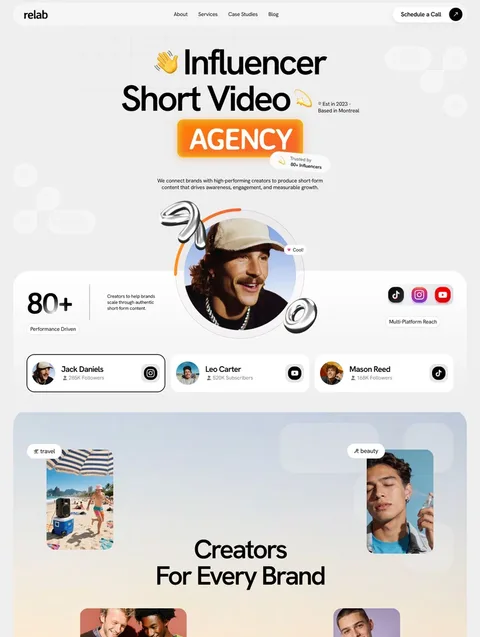

Frequently asked questions
What should a website wireframe include?
A website wireframe should include every block on the page in order, a draft headline and button label for each, image placeholders, and the navigation and footer. Leave out colour, final fonts and decoration until the structure is agreed.
What is the difference between a wireframe and a mockup?
A wireframe shows a page's structure with grey boxes and draft copy, while a mockup shows the finished visual design as a still image. You agree the wireframe first, then style it into a mockup or straight into a template.
What is the best free tool to wireframe a website?
Paper costs nothing and is fastest for a first pass. For a digital wireframe, Figma's free Starter plan and Whimsical's free plan both work; Whimsical limits the free plan to 50 board objects a month.
Should I wireframe mobile or desktop first?
Wireframe mobile first or at least alongside desktop. Google indexes the mobile version of a page, so the mobile layout must carry all the content, and one narrow column quickly shows whether the block order works.
How long does it take to wireframe a website?
A low-fidelity wireframe takes minutes per page, so a five-page site can be sketched in an afternoon. High-fidelity wireframes with real copy take hours per page, mostly because writing the copy takes the time.
Can I use a template instead of wireframing?
You can, but sketch a quick wireframe first so you know which blocks you need. Then pick a template whose page structure matches it, and you skip the visual design stage instead of the planning stage.
Website wireframe examples are most useful as a checklist: list the blocks, order them by what a visitor needs first, draw mobile before desktop, and agree on the plan before styling anything. Paper, Balsamiq, Whimsical and Figma all work; pick the one your reviewers will open.
When the structure is settled, you don't have to design every page from scratch. Browse the Figma website templates, where each design file is $19 or $49 for all 46, with Zelda's and Medonix's free. If you'd rather hand the whole job over, our customisation service adapts a template to your brand for $499.

More from Kazi
Related articles
More in Design Craft
Website Fonts: How to Choose and Pair Them in 2026
How to choose, pair, size, license and load website fonts, with the real pairings used in six live templates.
Hero Section Design: What Works in 2026
A practical guide to hero section design: what the first screen must say, which layout to pick, and how to keep images, video and text fast and readable.
One Page Website Design: What It Needs in 2026
A practical guide to one page website design: when one page is enough, which sections it needs, how the navigation works and where it falls short for SEO.