Pricing Page Design: What Works in 2026
How to lay out plans, billing terms, comparison tables and FAQs so visitors can pick a plan without guessing.
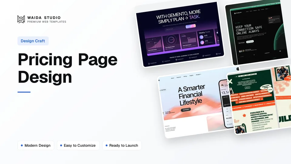
Good pricing page design lets a visitor pick a plan in under a minute. Show two to four plans side by side, give each one price and one sentence saying who it is for, mark the plan most people should choose, put the full comparison in a table below, and answer billing questions before checkout.
What Should a Pricing Page Include?
A pricing page needs plan cards with a name, a price, the billing term, a short list of what is included and one button each. Below the cards, add a comparison table, an FAQ and a way to ask a question. The table shows when each part earns its place.
Element | Include when | Notes |
|---|---|---|
Plan cards (2–4) | Always | Name, price, billing term, 3–6 included items, one button |
Who each plan is for | Always | One line per card, e.g. "For one person" or "For teams of up to 3" |
Billing toggle | When you offer more than one term | Monthly or quarterly vs annual; say the saving next to the annual option |
Recommended plan marker | When one plan suits most buyers | A text label such as "Most popular", not only a colour |
Free plan or trial | When you offer one | Say what it lacks, so nobody upgrades by surprise |
Comparison table | When plans differ in more than 5 ways | Plans as columns, features as rows |
Billing FAQ | Always | Cancelling, refunds, renewals, taxes, upgrading and downgrading |
Contact or sales link | When some buyers need a quote | "Talk to us" for teams, agencies or custom volumes |
Keep the page reachable from the main menu, and link it from your hero section or the closing call to action on the home page. People who are ready to pay look for the word Pricing in the header first.
How Many Plans Should You Show?
Show three plans when you can, and never more than five side by side. Three gives a starter option, a main option and a bigger option, which covers most buyers without a long comparison. One plan works when your product has a single price; two works when the split is simply "one person" against "team".
The limit of five comes from how people compare. Nielsen Norman Group's guide to comparison tables recommends tables for up to 5 items, notes that pricing packages and membership levels are a natural fit, and suggests that even five can be too many when the attributes are complex. Past that point people stop weighing each option and start filtering by one factor, usually price.
A single plan is a fair choice for simple products. It turns the page into a short sales page: one price, what it includes, the terms ("No setup fee. Cancel anytime.") and one button. You lose the side-by-side comparison, so the list of what is included has to do more work.
How to Name and Price Each Plan
Name plans by who they are for or by size, and write the price the way people will actually pay it. "Free, Pro, Ultra" or "Starter, Team, Business" work because the order is obvious. Clever names that hide the order make people read every card to find out which one is bigger.
- One price per card. If you show a monthly figure for an annual plan, say "billed yearly" right under it. Don't also print the yearly total, a crossed-out price and a per-day figure on the same card.
- State the term. "/month", "/quarter" or "one payment" belongs next to the number, not in the small print.
- Say what a plan does not include. A greyed line such as "No team seats" saves a refund request later.
- Lead the feature list with the difference. Put what this plan adds over the one before it at the top, not a repeat of what every plan has.
- Use plain units. "3 team members" or "1 template every quarter" beats "3 seats" or "4 credits a year" when your buyers are not used to the terms. Where a term is unavoidable, define it in a tooltip or the FAQ.
Decide early whether you show prices at all. Figma's guide to pricing page best practices points out that consumer products usually show prices upfront, while business products sometimes offer packages broken down by company size instead. If you hide the price for your largest plan, say what decides it (seats, volume, support) so the "Contact sales" button doesn't feel like a trap.
Billing Toggles and Annual Discounts
A billing toggle switches every card between terms, such as monthly and annual, so people can compare one term at a time. Put it directly above the cards, start it on the term you want most people to choose, and write the saving next to the annual option, as our own pricing page does with "Annually, save 20%", so nobody has to do the maths.
On our page that figure holds for both paid plans: Pro is $15 a month billed quarterly or $12 billed yearly, and Ultra $45 or $36. Make sure your saving is true for every plan it sits above. If the discount differs between plans, either show it on each card or drop the percentage from the toggle. A visitor who works it out and finds a smaller number stops trusting the rest of the page.
Build the toggle so screen-reader users hear its state, not just sighted users. The W3C ARIA Authoring Practices give two clean options: a toggle button with aria-pressed whose label stays the same when it changes, or a radio group where the selected term has aria-checked set to true. A radio group suits three or more terms, such as quarterly, annual and lifetime.
Toggle choice | Good for | Watch out for |
|---|---|---|
Two-state switch (monthly / annual) | Two terms | Users must be able to tell which side is on without relying on colour |
Segmented control (radio group) | Three or more terms | Each segment needs a visible label and a clear selected state |
Separate cards per term | Lifetime or one-off deals next to subscriptions | Doubles the number of cards; keep it to one row |
No toggle, annual only | Products sold yearly | Say "billed yearly" on every card |
Comparison Tables That People Can Scan
A comparison table goes below the plan cards and lists every feature as a row and every plan as a column. That is the standard layout Nielsen Norman Group recommends: options across the top, attributes down the left, short values instead of sentences, and consistent wording in every cell so differences stand out.
- Keep the plan names visible. On a long table, make the header row sticky so people don't forget which column is which as they scroll.
- Use the same value format in a row. "Up to 5", "Up to 10", "Unlimited" reads at a glance; mixing jokes or synonyms in the cells makes people stop and decode them.
- Group rows. Put features under short headings (Usage, Support, Security, Billing) once the table passes a dozen rows.
- Define unfamiliar terms. A tooltip or a link to the FAQ next to the row label is enough.
- Don't rely on colour or icons alone. WCAG 2.2 Use of Color (Level A) says colour cannot be the only way information is shown, so a tick needs a text alternative and the recommended column needs a text label.
Mark the table up as a real table. The W3C WAI tables tutorial shows the pattern for a table with headers in the top row and the first column: th cells with scope="col" for plan names and scope="row" for feature names, plus a caption that names the table. Without it, a screen reader reads "Included" with no idea which plan or feature it belongs to.
On phones, a four-column table rarely fits. Either let the table scroll sideways with the feature column fixed, or let people pick two plans to compare. Don't shrink the text until it is unreadable.
The FAQ and Trust Details Under the Plans
The FAQ on a pricing page should answer billing questions, not repeat the feature list. Cover what happens when someone cancels, whether there are refunds, how renewal works, whether prices include tax, how upgrading and downgrading work, and what the licence or contract allows. Each answer should stand on its own in two or three sentences.
Put the details people check before paying near the buttons: the payment provider, whether a card is needed for the free plan, the refund policy if you have one, and a link to your terms. Only promise what your checkout really does. A "30-day money-back guarantee" line is a good reassurance, but only if your refund process honours it.
Testimonials and logos can sit lower on the page, but keep them real and attributable. A short website footer with links to terms, privacy and contact finishes the page and gives cautious buyers somewhere to check.
Should You Add Structured Data to a Pricing Page?
Usually not for the page itself. Google's software app structured data can show an app's price in search, but it requires the app name, an offers.price (0 when free) and a rating or review, and those must follow Google's review rules. If you have no genuine ratings, skip it.
What helps more is plain HTML: prices written as text rather than baked into images, a clear H1 such as "Pricing" or "Plans and pricing", and a title tag that names the product. Assistants and search engines can then quote your prices correctly.
Pricing Page Examples From Our Templates
The three templates below are Waida Studio's own, and each ships a pricing page you can adapt. The prices on them are demo copy; you replace them with yours. Our own pricing page is a fourth example: Free, Pro and Ultra cards with a Quarterly, Annually (save 20%) and Lifetime switch, annual selected first and one price per card.
Gemento: Three Tiers and a Full Comparison

Gemento's pricing page has three plans (Free, Popular and Pro) with the middle one labelled, a feature comparison table under the cards and an FAQ grouped by topic. It is a dark SaaS template with HTML, Next.js and Astro versions, from $39 for HTML.
ShieldifyVPN: Plans, Compare Table and a Guarantee

ShieldifyVPN shows three plans with the same feature rows in each card, then a "Compare Plans" table where every row uses the same format ("Up to 5", "Up to 10", "Unlimited"), and a closing banner with a money-back line and a free-trial button. It is free on Framer, $79 on Webflow and $39 as HTML.
Check out ShieldifyVPN template
Finos: The Single-Plan Layout

Finos uses the one-plan approach: a "Starting from" price, a short list of what is included and "No setup fee. Cancel anytime." next to one button. It suits a product with one price. Finos is free on Framer and $59 on Webflow.
For more on the pages around pricing, see our guides to SaaS website design and the SaaS landing page, or browse every SaaS template.
Pricing Page Checklist
Run through this list before you publish a pricing page or change a price. Most of the items take minutes to check, and each one removes a reason to leave the page or to ask for a refund later.
Check | Pass when |
|---|---|
Plan count | Two to four cards, five at most, in one row on desktop |
Price clarity | One price per card with its billing term next to it |
Who it's for | Every card has one line naming its buyer |
Toggle | Saving is true for every plan; state is announced to screen readers |
Recommended plan | Marked with text, not only colour |
Comparison table | Plans as columns, features as rows, th + scope, sticky header on long tables |
Mobile | Cards stack in order; the table scrolls or compares two plans |
FAQ | Covers cancelling, refunds, renewals, tax and upgrades |
Checkout | Every button opens the right plan and term; prices match the checkout page |
Prices as text | No prices inside images |
Templates to start from
All 46 templates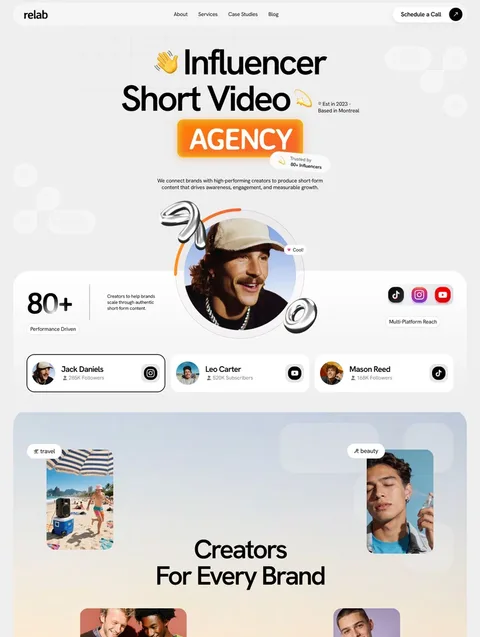


Frequently asked questions
What makes a good pricing page design?
A good pricing page shows two to four plans side by side, each with one price, its billing term and one line about who it suits. It marks the recommended plan with text, compares features in a table below and answers billing questions in an FAQ.
How many pricing plans should a website show?
Three plans suit most products: a starter, a main and a larger option. Show no more than five side by side, because comparison gets much harder past that point. One or two plans are fine when your pricing is simple.
Should a pricing page default to monthly or annual billing?
Start the toggle on the term you want most people to choose, which is usually annual. Show the saving next to the annual option and make sure that saving is true for every plan on the page.
Do pricing comparison tables need to be accessible?
Yes. Mark them up as real tables with th cells and scope attributes so screen readers can pair each value with its plan and feature. Don't use colour or tick icons as the only way to show what is included.
Should I hide prices and use a Contact sales button?
Show prices whenever you can, so visitors can judge the fit without writing to you first. For a custom or high-volume plan, a Contact sales button is fine if you say what decides the price, such as seats or volume.
A pricing page works when nobody has to guess: a few plans, one price each with its term, a clear recommendation, a comparison table that reads at a glance and a billing FAQ. Test every button against your checkout after any change, because a mismatched price costs more trust than any layout can win back.
Gemento, ShieldifyVPN and Finos above each include a pricing page you can adapt. All of our Framer templates are free with a free Waida account, and Waida Pro costs $12 a month billed yearly. If you would rather have us set it up, template customisation is $499 with 7-day delivery.

More from Kazi
Related articles
More in Design Craft
Website Header Design: What Works in 2026
What belongs in a website header, how to structure the navigation, when a sticky header helps and how to build a mobile menu people can actually use.
About Us Page Design: What Works in 2026
What an About Us page needs, in what order, how to write the story and show the team honestly, and which proof is worth including.
Contact Page Design: What Works in 2026
What a contact page needs, how short the form should be, how to stop spam without puzzles and how to make every field accessible.