Website Footer Design: What Works in 2026
What belongs in a website footer, which layout suits your site, how to write the copyright line and how to make the footer work on a phone.
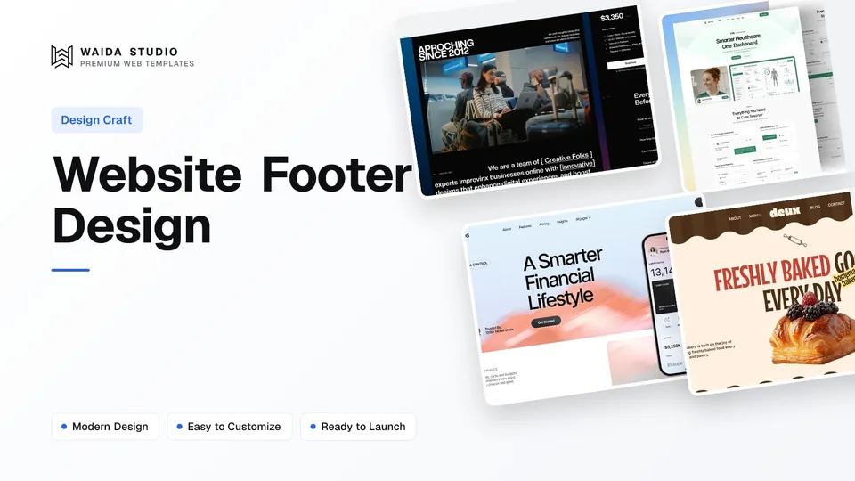
Good website footer design gives visitors who reach the bottom of a page a way forward: contact details, links to every key page, the legal links, a copyright line and, where it fits, one call to action or a newsletter sign-up. Keep it grouped, readable on a phone and the same on every page.
What Is a Website Footer For?
A website footer is the block at the bottom of every page that answers the questions people still have after reading: how do I contact you, where is the page I wanted, and is this a real business. It is the last thing on the page and often the first place returning visitors scroll to.
In HTML it is the footer element. MDN describes a footer as typically holding information about the author, copyright data or links to related documents, and notes that a page-level footer maps to the contentinfo landmark, which screen reader users can jump to directly (MDN on the footer element).
The footer is not where you make your main argument. That job belongs to the first screen and the sections under it; our hero section guide and homepage design principles cover those. The footer catches everyone the page did not route somewhere else.
What to Put in a Website Footer
Put in a footer only what a visitor might need on any page: how to reach you, links to your main and secondary pages, legal links and the copyright line. Add a newsletter form, opening hours or a call to action when your site has a real use for them. The table shows when each element earns its place.
Element | Include when | Notes |
|---|---|---|
Contact details (email, phone, address) | Almost always | Make the email a mailto: link and the phone a tel: link so they work with one tap |
Main page links | Always | Mirror the top menu, then add the pages that are not in it |
Secondary links (careers, FAQ, changelog, press) | When those pages exist | Group them under a short label such as Company or Resources |
Legal links (privacy, terms, cookies) | Whenever you collect data or sell anything | Label them plainly; do not hide them in tiny grey text |
Copyright line | Always | Symbol or word, year, owner name; see the section below |
Social links | When the accounts are active | Use the network names as labels or give icon links an accessible name |
Newsletter sign-up | When you send a newsletter people want | One email field and one button; say what they will get |
Opening hours or location | Shops, restaurants, clinics, local services | The thing local visitors check most; keep it identical to your Google listing |
Call-to-action band above the footer | Service businesses and SaaS | One action, the same as the page's main action |
Back to top link | Long pages | Helpful on mobile; not needed on short pages |
Leave out anything that only matters on one page, long blocks of keyword text, and repeated badges or logos that slow the page down without telling the visitor anything new.
Footer Layouts by Site Type
Pick the footer layout by how many pages you have and what you want visitors to do next. Small sites need a minimal footer; sites with dozens of pages need grouped link columns; lead-driven sites benefit from a call-to-action band sitting directly above the links.
- Minimal footer. Logo, a single row of links, contact email and copyright. It suits portfolios, one-page websites and small studios with five or six pages.
- Column footer (sometimes called a fat footer). Three to five labelled link columns such as Product, Company, Resources and Legal, plus contact details. It suits SaaS, agencies and any site with more pages than the top menu can hold.
- CTA-led footer. A full-width band with one heading and one button (book a call, start a trial, get a quote) above a smaller link area. It suits service businesses, where the visitor who scrolled to the bottom is often ready to act.
- Local business footer. Address, phone, opening hours and a map link take the most space; page links are secondary. It suits restaurants, bakeries, clinics and trades.
Whatever the layout, keep column labels short, keep the order of columns the same on every page and use one alignment grid with the rest of the site, so the footer reads as part of the design rather than an afterthought.
How to Write the Copyright Line
A website copyright line needs three things: the © symbol or the word "Copyright", the year and the name of the owner, for example "© 2026 Studio Name". In the US a notice is optional for works published on or after 1 March 1989, but it still has practical uses.
The US Copyright Office's Circular 3 on copyright notice states that notice is optional for works published on or after 1 March 1989, and describes an effective notice as the symbol or word, the year of publication and the owner's name, written as one continuous statement. It also lists why a notice still helps: it identifies the owner for anyone seeking permission and can stop an infringer from claiming an innocent infringement defence.
Phrases such as "All rights reserved" are not among those three elements, so add them only if you like the wording. Use the business's legal or trading name, and if you show a range ("© 2019–2026"), update the end year or generate it automatically. This is general information, not legal advice; check the rules where you operate.
Mobile Footer Design
On a phone, stack the footer into one column, put contact details and the main action first, and give every link enough room to tap. Four link columns side by side become a long, cramped list, so either stack the groups with clear labels or collapse them into expandable sections.
- Tap targets. WCAG 2.2 sets a minimum of 24 by 24 CSS pixels for pointer targets at level AA, with an exception for links inside a sentence (W3C, Target Size Minimum). Footer link lists are not sentences, so space them out.
- One-tap contact. Phone numbers as tel: links and emails as mailto: links matter most on mobile, where people call rather than copy.
- Order. Contact and the main action before secondary links, then legal links and the copyright line last.
- Forms. A newsletter field should be full width with the button beneath or beside it at a usable size; our Framer forms guide covers sign-up and contact forms in detail.
- Weight. Avoid autoplaying video, large images and heavy embeds such as live maps in the footer; a link to the map does the same job.
Footer Accessibility Checks
An accessible footer uses the footer element, has readable contrast, gives every link a name that says where it goes and keeps help options in the same place on every page. These checks take a few minutes and catch the most common footer problems.
Check | What to look for | Source |
|---|---|---|
Landmark | Page footer is a footer element (not nested inside main or an article), so it exposes the contentinfo landmark | |
Contrast | At least 4.5:1 for normal text, 3:1 for large text; pale grey on white often fails | |
Consistent help | Contact details, contact forms, chat or help links appear in the same order relative to other content on every page | |
Target size | Links and icons at least 24 by 24 CSS pixels, or spaced so they do not overlap | |
Link names | Icon-only social links carry a text label for screen readers; no "click here" | Good practice |
Consistent Help is a level A criterion in WCAG 2.2, the lowest level, and a footer is the natural place to meet it: a contact block that sits in the same spot on every page satisfies it without extra work. Add these checks to your website launch checklist so they get done before the site goes live.
Footer Examples from Waida Templates
These four Waida Studio templates show the main footer patterns in finished form. They are our own templates, so treat them as examples of the layouts above rather than an independent ranking. We read each footer on its live preview before writing this.
Zelda: minimal agency footer

Zelda's footer keeps to a contact email, a Quick Links column for the seven main pages, a Social column, phone, street address, a one-line description of the studio and the copyright line. It is a clean minimal footer for an agency or studio. Zelda is free on every platform with a free Waida account, Figma file included.
Medonix: CTA band and grouped links

Medonix puts a call-to-action band ("Revamp Your Healthcare Workflow" with a Get Started button) directly above the footer, then a newsletter field and three labelled link groups: main pages, inner pages and utility pages, followed by contact details. It is the pattern most SaaS sites need. Medonix is also free on every platform with a free account.
Finos: column footer with working hours

Finos uses Product, Company and Utility columns, a newsletter sign-up, contact details, working hours and a back-to-top link. It shows how a SaaS footer can still answer practical questions such as when support is available. Finos is free on Framer with a free account; the Webflow version is $59.
Deux: local shop footer

Deux, a bakery template, keeps navigation, a newsletter sign-up, phone and email in the footer and closes with a large, repeated "Bakery Store" wordmark, so the footer carries the brand as well as the links. Deux is free on Framer with a free account, and the HTML version is $39.
Common Website Footer Mistakes
Most footer problems come from treating it as storage for everything that did not fit elsewhere. Watch for these mistakes when you review your footer.
- Too many links. Fifty links in eight columns are hard to scan. Group them, and drop the ones nobody uses.
- Unreadable text. Small, low-contrast grey text on a dark or pale background fails the 4.5:1 contrast minimum.
- Different footers on different pages. Visitors and assistive technology rely on finding the same thing in the same place.
- Placeholder content left in. Template example emails, phone numbers and addresses are easy to miss at the bottom of the page; replace every one before launch.
- Dead social links. Remove networks you do not post on rather than linking to an empty profile.
- A stale year. A copyright line that is several years old makes an active business look abandoned.
Templates to start from
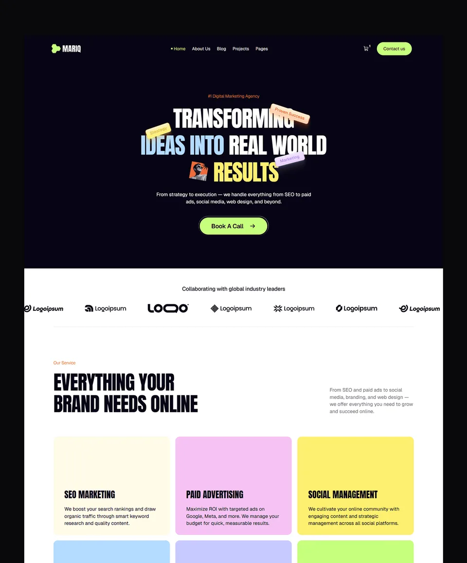
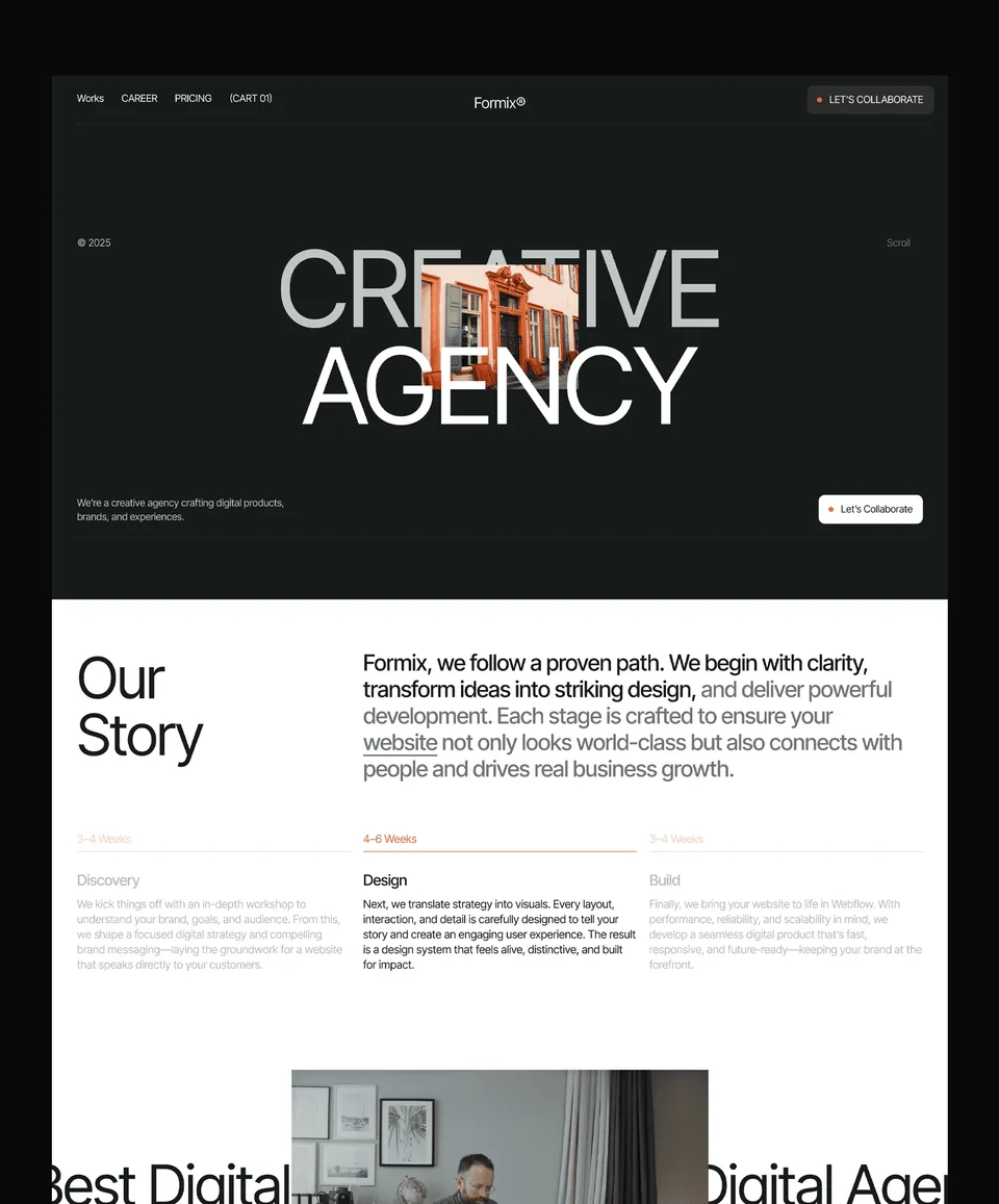
All 46 templates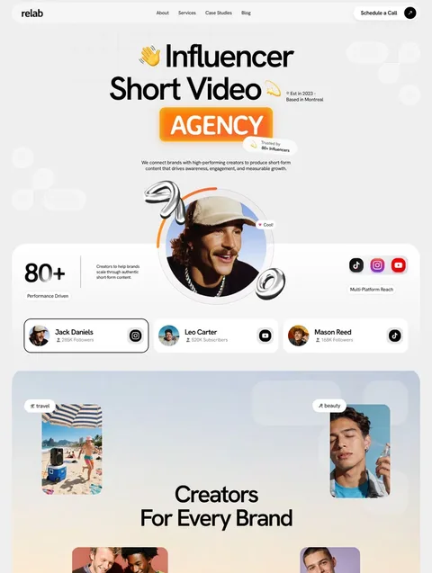


Frequently asked questions
What should be in a website footer?
Contact details, links to your main pages, legal links such as privacy and terms, and a copyright line. Add social links, a newsletter form, opening hours or a call to action only when your site has a real use for them.
Is a copyright notice required in a website footer?
In the US, no. The Copyright Office says notice is optional for works published on or after 1 March 1989, but a notice identifies the owner and can block an innocent infringement defence, so most sites include one.
What is the correct format for a website copyright line?
Use the © symbol or the word Copyright, the year and the owner's name as one statement, for example "© 2026 Studio Name". "All rights reserved" is optional wording.
How should a footer look on mobile?
Stack it into one column, put contact details and the main action first, and space links so each tap target is at least 24 by 24 CSS pixels. Long link groups can collapse into expandable sections.
Should the footer be the same on every page?
Yes. Keeping the footer identical helps visitors find contact details and links quickly, and WCAG 2.2 asks for help options repeated across pages to stay in the same relative order.
Do footer links help SEO?
Footer links give every key page a crawlable link from every page of the site, which helps discovery. They do not replace descriptive links in your page content, and stuffing a footer with keyword links helps no one.
A good website footer is short, grouped and identical on every page: contact details, the links people look for, legal links, a correct copyright line and one action where it helps. Get it readable and tappable on a phone, and run the accessibility checks before launch.
If you would rather start from a finished footer, every Waida template ships with one. All of our Framer templates are free with a free account, Zelda and Medonix are free on every platform, and paid templates on other platforms cost $39 to $129. Every licence covers unlimited personal, commercial and client projects (licence terms).

More from Kazi
Related articles
More in Design Craft
Website Header Design: What Works in 2026
What belongs in a website header, how to structure the navigation, when a sticky header helps and how to build a mobile menu people can actually use.
Pricing Page Design: What Works in 2026
How to lay out plans, billing terms, comparison tables and FAQs so visitors can pick a plan without guessing.

About Us Page Design: What Works in 2026
What an About Us page needs, in what order, how to write the story and show the team honestly, and which proof is worth including.