Hero Section Design: What Works in 2026
A practical guide to hero section design: what the first screen must say, which layout to pick, and how to keep images, video and text fast and readable.
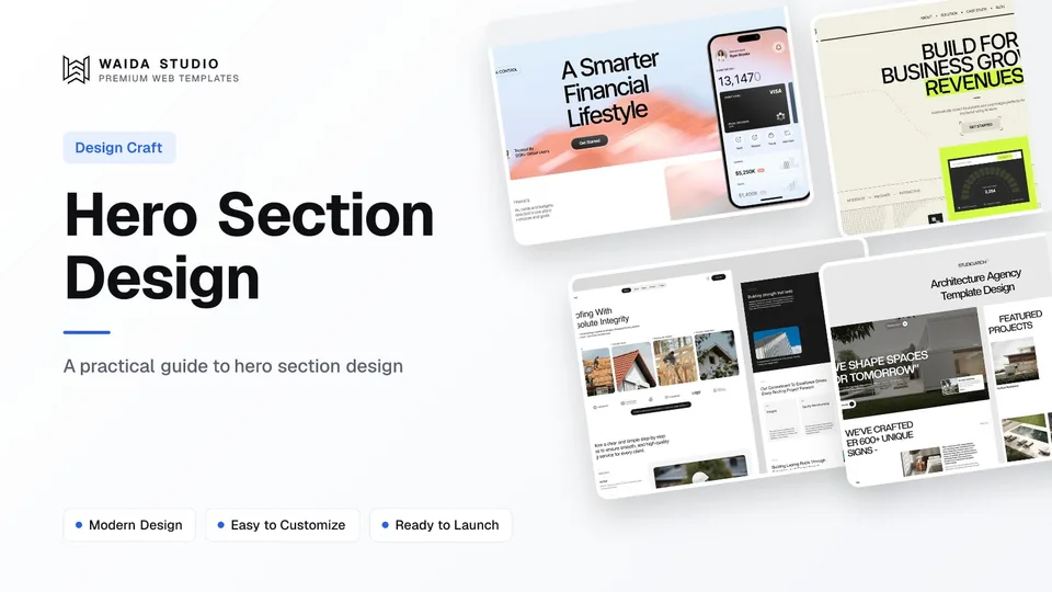
A hero section is the first screen of a web page: a headline that says what you offer, a line that says who it is for, one main button, a visual and a short proof point. Good hero section design gets those five parts readable in a few seconds, loads fast, and works on a phone as well as a laptop.
What Is a Hero Section?
A hero section is the large block at the top of a page, above everything else a visitor scrolls to. It is the part people see before they decide whether to keep reading, so its job is to answer three questions quickly: what is this, is it for me, and what do I do next.
It sits above the fold, which is why it carries so much weight. In Nielsen Norman Group's eyetracking study, people spent about 57% of their page-viewing time above the fold and 74% in the first two screenfuls, according to its article on scrolling and attention. People do scroll; they just give the top of the page the most attention.
The hero is not the whole pitch. It should earn the scroll, not answer every objection. Features, pricing, testimonials and FAQs belong further down, in the order our guide to landing page design sets out.
The Five Parts Every Hero Needs
Every hero needs a headline, a supporting line, one primary button, a visual, and a small piece of proof. You can add a secondary link or a short form, but if any of the five is missing, the visitor has to work harder to understand the page. Here is what each part does and where it usually goes wrong.
Part | Its job | Common mistake |
|---|---|---|
Headline | Say what you offer in plain words | A slogan that could fit any company |
Supporting line | Say who it is for and what changes for them | Repeating the headline in longer words |
Primary button | Give one clear next step | Three buttons with equal weight |
Visual | Show the product, the work or the result | Stock photo that shows nothing specific |
Proof | Give a reason to believe: clients, ratings, a number | Claims with no name or source behind them |
A secondary action, such as "See pricing" or "View work", is fine as a text link or an outlined button next to the main one. Keep it visibly weaker, so the visitor never has to choose between two equal options.
How to Write the Headline and Supporting Line
Write the headline as what the visitor gets, in words they would use themselves, and keep it short enough to read at a glance. Then use the supporting line for the detail the headline left out: who it is for, what it replaces, or how fast it works.
- Name the thing. "Roof repair and replacement in Leeds" beats "Building a better tomorrow". A visitor from search should recognise their query.
- One idea per line. If the headline needs a comma and an "and", it is probably two headlines.
- Specific over clever. Wordplay can work for a studio with a strong brand, but a service business or product usually does better saying exactly what it does.
- Match the button to the promise. If the headline offers a quote, the button says "Get a quote", not "Learn more".
- Write the subline last. Once the headline is fixed, the supporting line fills the gap: audience, outcome or the main difference from alternatives.
A quick test: cover the visual and read only the headline, subline and button. If a stranger can say what you sell and what happens when they click, the words are doing their job.
Hero Section Layouts and When to Use Each
Pick the layout from what you need to show. A product shows its interface, a service business shows the result of its work, and a studio or portfolio can lead with type or a single strong image. Most heroes are one of five patterns.
Layout | Best for | Watch out for |
|---|---|---|
Split: text left, visual right | SaaS, apps and most business sites | Visual collapsing below the fold on mobile |
Centred text, visual below | Products with a wide screenshot or dashboard | Too much empty space before the visual |
Full-bleed photo or video behind text | Hotels, restaurants, trades, events | Text contrast over busy parts of the image |
Type only, oversized headline | Agencies, studios, portfolios | Saying nothing concrete to a first-time visitor |
Hero with a form | Lead generation, waitlists, quotes | Asking for too many fields up front |
For a product page, a split or centred layout with a real screenshot is the safe default; our SaaS landing page guide goes into what that screenshot should show. For a single-page site, the hero also has to carry the menu, which the one page website design guide covers.
Images, Video and Motion in the Hero
The hero image or video is often the largest thing on the first screen, which makes it the element that decides your Largest Contentful Paint. Google's guidance on Largest Contentful Paint says a good score is 2.5 seconds or less, and it counts images, video posters, background images and large text blocks.
That gives you a short list of rules for hero media, each from Google's or the browser makers' own documentation:
- Don't lazy-load the hero image. Lazy loading is for content further down; web.dev's study of lazy-loading and LCP concludes that pages may benefit from loading above-the-fold images eagerly.
- Raise its priority. Adding the attribute fetchpriority="high" to the hero image lets it start loading at high priority straight away, as the Fetch Priority guide explains. For a CSS background image, put the attribute on a preload instead.
- Size it for the screen. Serve smaller files to phones with responsive images, and compress the file; a full-width photo rarely needs to be the original export.
- Background video must be muted to autoplay. Chrome's autoplay policy allows muted autoplay; video with sound waits for the visitor. Always set a poster image so something shows before the video loads.
- Give motion a stop button. Under WCAG's Pause, Stop, Hide criterion, moving content that starts on its own and lasts more than five seconds needs a way to pause, stop or hide it.
Entrance animations on the headline are fine if they are quick and finish before the visitor starts reading. Respect the prefers-reduced-motion setting, which tells you a visitor has asked their device to minimise non-essential motion, and show the text without the animation for them. All of this feeds into your Core Web Vitals.
Contrast and Readability
Hero text has to meet the same contrast rules as any other text, and text over photos is where most heroes fail. WCAG's contrast minimum at level AA is 4.5:1 for normal text and 3:1 for large text, which it defines as at least 18 point, or 14 point bold.
The same page lists background images that don't give enough contrast with the text on top as a known failure. Practical fixes:
- Put a dark or light overlay between the photo and the text, and check contrast against the busiest part of the image, not the average.
- Choose or crop photos with a calm area where the headline sits.
- Check the supporting line too. It is smaller than the headline, so it usually needs the full 4.5:1.
- Keep body-size text out of video heroes, where the background changes frame by frame.
Hero Section Design on Mobile
On a phone the hero has less than half the width, so the order matters more than the layout. Headline first, then the supporting line and the button, with the visual after or behind them. The visitor should see the main button without scrolling.
Check | What to look for |
|---|---|
Button visible | Primary button shows on a small phone without scrolling |
Headline length | Wraps to no more than three or four lines |
Visual | Cropped or swapped for a portrait version, not shrunk to a sliver |
Tap targets | Buttons are thumb-sized and not crowded together |
File size | Phones get a smaller image than desktops |
Sticky elements | Cookie banner and chat widget don't cover the button |
Test on a real phone as well as in the browser's device view; banners and browser toolbars take more room than the preview suggests.
Hero Section Examples From Waida Templates
These are three of our own Waida Studio templates, chosen because each uses a different hero pattern from the table above. We checked each live preview today; the descriptions are of the home page hero as it ships.
Finos: product-led split hero

Finos is a personal finance template. Its hero has a small label and trust line above the headline "A Smarter Financial Lifestyle", a Get Started button, and the product itself as the visual: app screens in phone frames with a wallet balance that rolls over as you watch. It is free on Framer with a free Waida account, $59 on Webflow, $39 in HTML and $49 in Next.js or Astro.
Avande: oversized type with a product card

Avande, an AI automation agency template, leads with a large uppercase headline, "Build for Business Growth", a one-line supporting sentence and a Get Started button, with a small dashboard card of automated tasks underneath. It shows how a type-led hero can still show something concrete. Avande is free on Framer, $99 on Webflow, $39 in HTML and $49 in Next.js or Astro.
Steelcrest: service hero with one clear action

Steelcrest is a roofing and construction template. The headline "Building Roofs That Last Forever" is followed by a line about craftsmanship and materials and a single Start Your Project button, with a Let's Talk button kept in the header. It is $79 on Framer and Webflow, $39 in HTML and $49 in Next.js or Astro.
Whichever you start from, rewrite the headline and supporting line for your own business first; template copy is placeholder text, including any numbers in the trust line.
Templates to start from
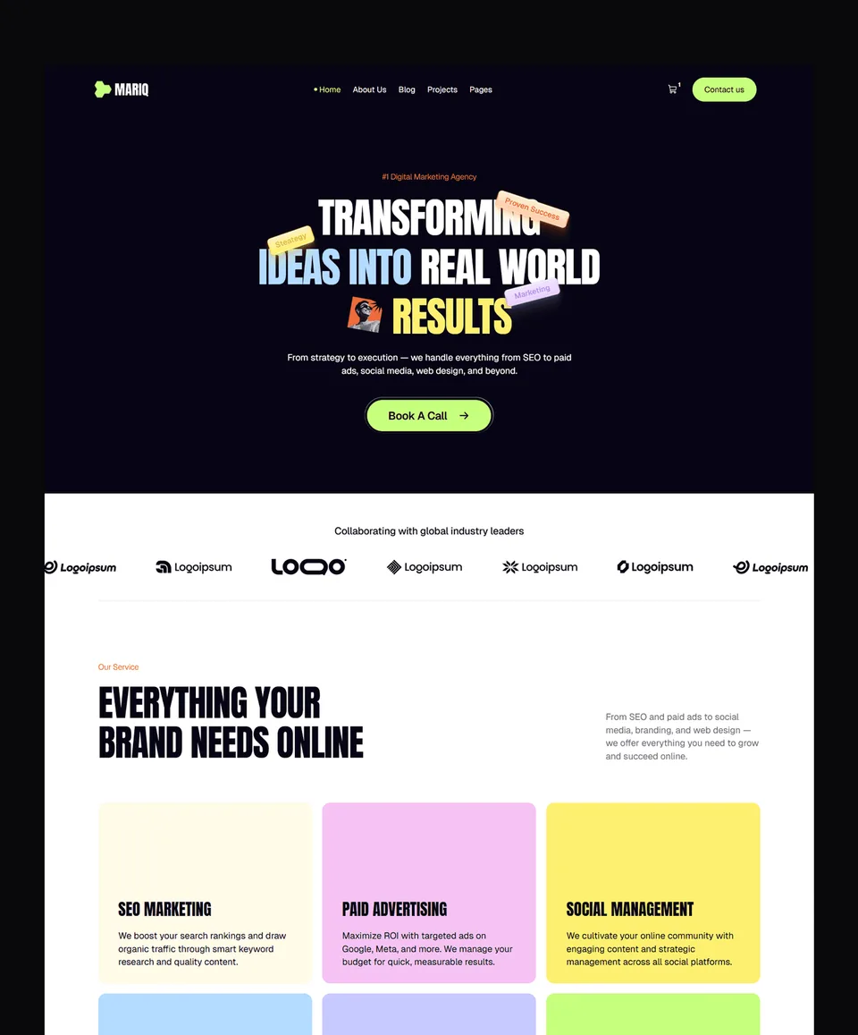
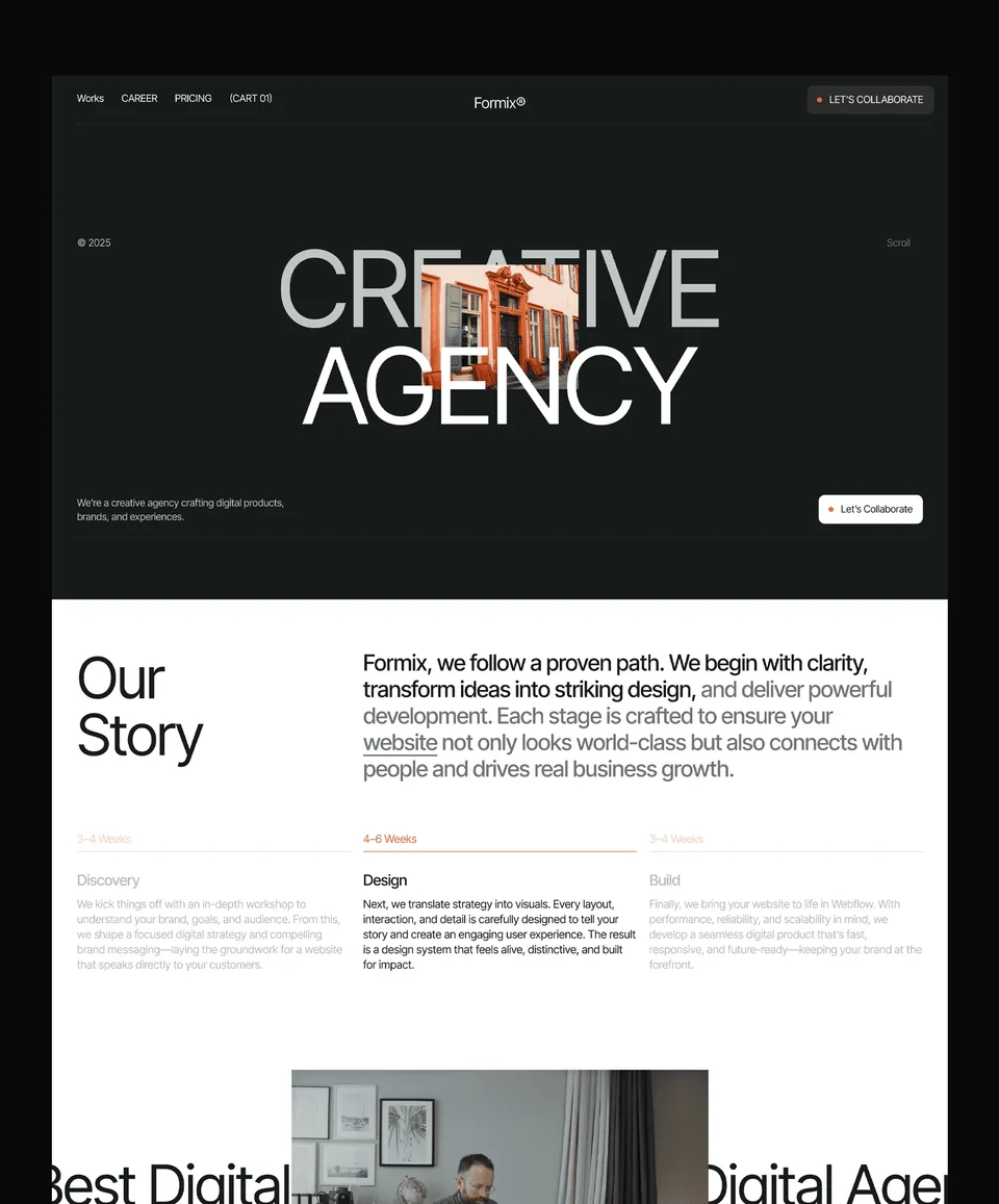
All 46 templates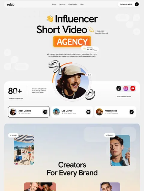


Frequently asked questions
What is a hero section on a website?
A hero section is the large first block at the top of a web page. It usually holds a headline, a supporting line, a main button, a visual and a short proof point, and its job is to make visitors keep scrolling.
What should a hero section include?
A clear headline saying what you offer, a supporting line saying who it is for, one primary button, a visual of the product or work, and a small proof point such as client logos or a rating.
How long should a hero headline be?
Short enough to read at a glance and to wrap to no more than three or four lines on a phone. One idea per headline is a good rule; move the detail to the supporting line.
Should the hero image be lazy-loaded?
No. The hero image is often the Largest Contentful Paint element, so it should load eagerly, ideally with fetchpriority set to high. Lazy loading is for images further down the page.
Can I use a background video in a hero section?
Yes, if it is muted, has a poster image, and can be paused. Browsers only autoplay muted video, and WCAG requires a pause control for motion that runs longer than five seconds.
What contrast does hero text need?
At WCAG level AA, normal text needs a contrast ratio of at least 4.5:1 and large text at least 3:1. Check text over photos against the busiest part of the image.
A hero section works when a stranger can tell what you offer, who it is for and what to click within a few seconds. Write the headline in the visitor's words, give one clear button, show the real product or work, load the main image first, and check contrast and the phone view before you publish.
To start from a finished hero, browse the Framer templates: 39 in total, 24 of them free with a free Waida account, and paid ones from $49 to $99. The Pro plan is $12 a month billed yearly, and if you would rather hand the work over, our customisation service starts at $499 with 7-day delivery.

More from Kazi
Related articles
More in Design Craft
Website Fonts: How to Choose and Pair Them in 2026
How to choose, pair, size, license and load website fonts, with the real pairings used in six live templates.
Website Wireframe Examples: How to Wireframe a Site in 2026
Six website wireframe examples you can copy block by block, with a seven-step method for drawing your own and a plain comparison of the tools.
One Page Website Design: What It Needs in 2026
A practical guide to one page website design: when one page is enough, which sections it needs, how the navigation works and where it falls short for SEO.