How to Design a Portfolio Website: What Works in 2026
A practical guide to designing a portfolio website: who it is for, the pages it needs, how to write case studies and how to make contact easy.
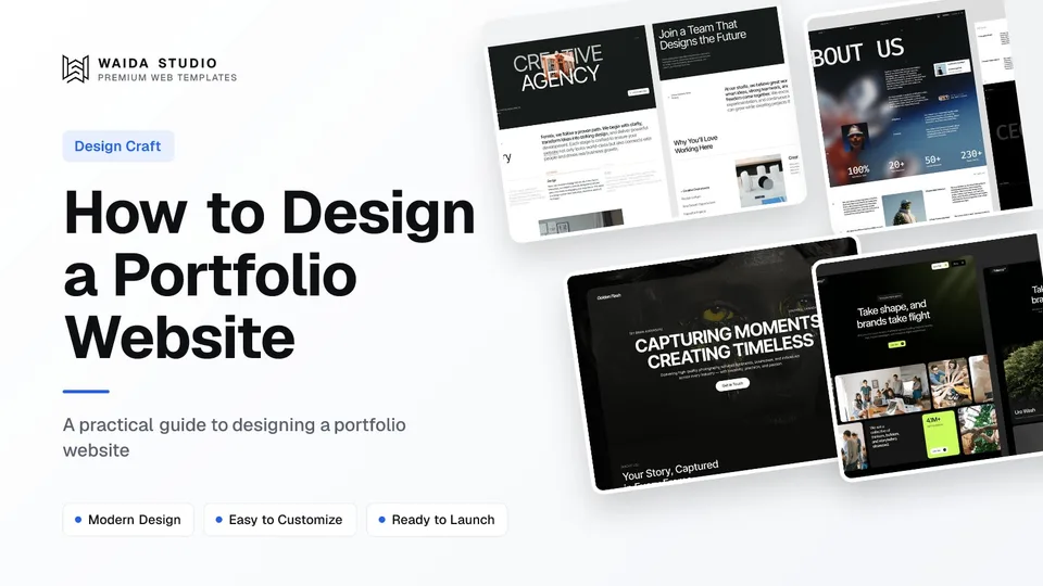
To design a portfolio website, decide who will hire you, then build a short site around your best four to eight projects: a homepage that shows the work straight away, one case-study page per project, a brief about page and a contact path that takes one click. Design comes after that structure, not before it.
This guide walks through each part in order. If you want to see finished sites first, our portfolio website examples collects real ones, and every section below ends with something you can check on your own draft.
Start With the Person Who Will Hire You
Every design decision on a portfolio gets easier once you name the visitor. A hiring manager at a product company, an agency creative director and a small-business owner looking for a photographer all arrive with different questions, and a portfolio that tries to answer all three answers none of them well.
Write one sentence before you open a design tool: "This site is for [who], who needs [what], and should leave by [contacting me / booking a call / downloading my CV]." That sentence decides which projects make the cut, what the headline says and where the main button goes.
- Job seekers (UX, product, graphic designers): the reader wants process and decisions, so case studies carry the site.
- Freelancers and studios: the reader wants proof you have solved their kind of problem, so client names, outcomes and a clear services line matter most.
- Photographers, filmmakers and illustrators: the reader wants to see the work large and fast, so image quality and load speed matter more than long text.
The Pages a Portfolio Website Needs
Most portfolios need five page types: home, work index, case study, about and contact. Anything beyond that, such as a blog, services or a shop, should exist only if it serves the visitor you named. Fewer, stronger pages beat a large site with thin ones.
Page | Its job | What it must include |
|---|---|---|
Home | Say what you do and show the work in the first screen | A one-line positioning statement, 3–6 project thumbnails, one contact button |
Work index | Let visitors pick the project closest to their need | Every project with a title, a one-line summary and a clear image |
Case study | Prove how you think, not only what you made | Problem, your role, process, the final work, the result |
About | Make you a person someone wants to work with | A photo, a short bio, clients or employers, the tools you use |
Contact | Turn interest into a message | Email address, a short form or booking link, your location or time zone |
If you are a one-person practice with only a few projects, a single long page with anchored sections can do the same job. The rule is the same either way: each section answers one question.
What to Show First on the Homepage
Show the work within the first screen. A visitor should see who you are, what you do and at least one project image before scrolling. A large animated intro, a long manifesto or a loading screen pushes the one thing they came for further down.
The strongest homepages pair a plain positioning line, such as "Brand identity and websites for independent restaurants", with a grid or list of selected projects directly underneath. Put your best project first, not your most recent one. If a project doesn't match the work you want more of, leave it out; the portfolio shapes the enquiries you get.
Keep one primary call to action across the page, usually "Get in touch" or "Book a call", and repeat it in the header and the footer rather than inventing new ones per section.
How to Structure a Case Study Page
A case study should read in two passes: a skimmer gets the problem, your role and the result from the top of the page, and a careful reader gets the process below. Most readers skim, so the summary block does most of the work.
- Summary block: client or context, your role, timeline, the tools used and one line on the outcome.
- The problem: what was wrong or missing, in two or three sentences, from the client's or user's side.
- Constraints: budget, deadline, technical limits or brand rules that shaped the decisions.
- Process: the two or three decisions that mattered, each with the sketch, wireframe or iteration that shows it.
- The final work: large images or video of the finished result, in context where possible (on a phone, on a shelf, in use).
- Result: what changed afterwards. Use a number only if you can stand behind it; otherwise describe what the client did next.
- Next project link: send the reader to another case study instead of a dead end.
Write the result honestly. If a project had no measurable outcome, say what shipped and what you learned. A number you cannot back up undermines everything else on the page.
Make the Contact Path One Click Long
A portfolio exists to start a conversation, so contact should be reachable from every page in one click. Put a contact link in the header, a closing call to action at the end of every case study, and your email address as plain, copyable text somewhere visible.
Keep the form short: name, email and message is enough for most freelancers. Add a budget or timeline field only if it genuinely helps you sort enquiries. If you take calls, a booking link saves a round of emails. Test the form yourself after launch, from a phone, and confirm the message actually arrives.
Design Details That Carry the Work
The design of a portfolio should frame the projects, not compete with them. Restrained type, generous spacing and consistent image sizes make varied work look like one body of work. These are the details worth checking on every page.
- Typography: one or two typefaces, a clear size scale, and body text large enough to read on a phone without zooming.
- Colour and contrast: a quiet palette so project images carry the colour. Body text should meet the WCAG contrast ratio of at least 4.5:1 (W3C: Contrast (Minimum)); see accessibility.
- Image consistency: the same aspect ratio for every thumbnail on the work index, so the grid reads as a set.
- Image weight: compress and resize images before upload. Google's guidance is a Largest Contentful Paint of 2.5 seconds or less (web.dev: Largest Contentful Paint), and a large uncompressed hero image can push a page well past it.
- Mobile layout: check every page at phone width; many first visits come from a link opened on a phone. Our glossary explains responsive design.
- Motion: keep animation short and purposeful; it should never delay the work appearing.
Choose Where to Build It
Pick the platform by who will edit the site after launch. Visual builders such as Framer and Webflow let you update projects without code; HTML, Next.js and Astro give you files you own and host anywhere, which suits developers. The design advice above is the same on all of them.
Build route | Suits | Waida portfolio template price |
|---|---|---|
Designers who want to edit visually and publish fast | Free to $99; 6 portfolio templates are free | |
Designers who want a structured CMS and fine layout control | $59–$99 | |
Anyone who wants plain files and any host | $39 | |
Developers who want a code base to extend | $49 |
Hosting and plan costs sit on top of the template on Framer and Webflow; our Framer pricing guide breaks those down. If you are weighing a template against a from-scratch build, template vs custom website compares cost and time.
Start From a Portfolio Template
A template gives you the page structure above on day one, so your time goes into projects and writing instead of layout. These four are Waida Studio's own portfolio templates, so treat this as our recommendation, not a neutral review. All four are free on Framer with a free Waida account.
Formix: for designers and small studios

Formix is built around presenting projects, services and the people behind them, with 15 pages. It suits a designer or small studio whose portfolio doubles as a services site. Free on Framer; $79 on Webflow, $39 as HTML and $49 on Next.js or Astro.
Egnis: for filmmakers and video portfolios

Egnis uses cinematic layouts for photography and video work, across 13 pages. It fits filmmakers and videographers whose case studies are mostly moving image. Free on Framer; $79 on Webflow.
Golden Flash: for photographers

Golden Flash is a dark template with bold typography for photographers, studios and visual artists, with 11 pages. The dark background keeps attention on the images. Free on Framer; $59 on Webflow.
Check out Golden Flash template
Brandora: for designers and developers with many projects

Brandora has CMS-powered projects and blog collections across 15 pages, so adding a new case study is a new CMS item rather than a new page. It suits designers and developers who publish work regularly. Free on Framer; $79 on Webflow.
The full set is on the portfolio website templates page, and platform-specific shortlists are in best Framer portfolio templates and best Webflow portfolio templates. Figma files are sold separately at $19 each.
Pre-Launch Checklist
Before you share the link, run through this list on a phone and a laptop. Each item takes a minute and catches the problems visitors notice first.
- The homepage says what you do in one line and shows project images without scrolling.
- Every case study has a summary block, a result and a link to the next project.
- Contact is one click from every page, and a test message from the form has arrived.
- Images are compressed, and the heaviest page loads quickly on mobile data.
- Page titles and meta descriptions name you and your discipline; on Framer, our Framer SEO guide goes further.
- Links to LinkedIn, Dribbble, Behance or GitHub open and point to your own profile.
- Placeholder text, sample projects and template images are all gone.
Templates to start from
All 38 templates



Frequently asked questions
How many projects should a portfolio website show?
Four to eight strong projects is enough for most designers. Choose work that matches the jobs or clients you want next, and put the best one first rather than the newest.
What pages does a portfolio website need?
A home page, a work index, one case-study page per project, an about page and a contact page. A single long page with anchored sections can replace them if you only have a few projects.
What should a design case study include?
A summary of the context, your role and the timeline, then the problem, constraints, the key decisions in your process, the final work and an honest result. End with a link to another project.
Should I use a template to design my portfolio website?
A template is a sound start if you customise the content fully and remove every placeholder. It saves layout time so you can spend it on case studies, which matter more to hiring managers and clients.
Are Waida Studio portfolio templates free?
Six Waida portfolio templates, including Formix, Egnis, Golden Flash and Brandora, are free on Framer with a free Waida account. Their Webflow, HTML, Next.js and Astro versions are paid.
A good portfolio website is a short, focused site: a clear line about what you do, your strongest projects written up as case studies, and a contact path that never takes more than one click. Get that structure right and the visual design has something solid to frame.
If you would rather start from a finished structure, browse the portfolio website templates: six are free on Framer with a free account, and every one is available as HTML for $39. Paid Framer and Webflow versions run $59–$99, or you can unlock templates with credits on the Pro plan.

More from Kazi
Related articles
More in Design Craft
Services Landing Page Design: What Converts in 2026
A practical guide to designing a landing page for a service business: sections, proof, one CTA, and four Waida templates built for it.
Landing Page Design: What Converts in 2026
What separates a landing page that converts from one that doesn't, section by section, with a checklist and examples from Waida's own SaaS templates.
Portfolio Website Examples: 16 Real Sites and What They Get Right
Sixteen real portfolio websites, checked live today and grouped by discipline, with what to copy from each one.