SaaS Landing Page: 8 Real Examples and Templates for 2026
Eight real SaaS landing pages checked live, what each does well, and the templates to start your own from.
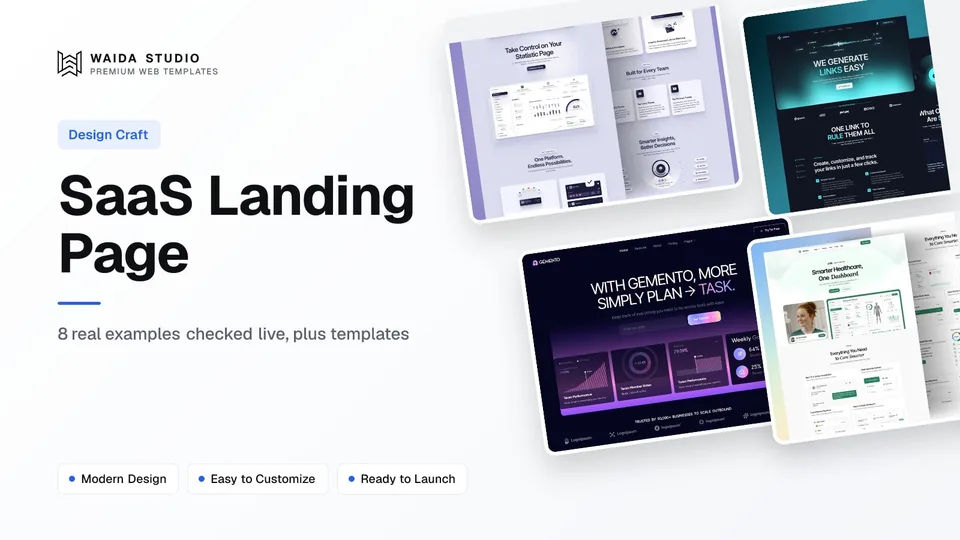
A good SaaS landing page does four things above the fold: it says what the product is, shows it working, offers a free start next to a sales path, and puts proof close to the buttons. The eight examples below, from Supabase, Clerk, Loops, Tally, Cursor, PostHog, Lemon Squeezy and Retool, each show one of those well.
Every page here was opened and read on 4 October 2026, and each note describes what the page said that day. SaaS companies rewrite their homepages often, so treat the details as a snapshot and the patterns as the lesson. For a wider set across industries, see our 20 landing page examples; for the whole site rather than one page, read our guide to SaaS website design.
The 8 Examples at a Glance
Page | What it sells | Headline (4 Oct 2026) | Worth studying for |
|---|---|---|---|
Postgres backend | Build in a weekend. Scale to millions | Two promises, two buttons | |
Authentication | More than authentication, Complete User Management | Showing the product as live UI | |
Email for SaaS | One platform for every email | Customer logos with dates | |
Form builder | The simplest way to create forms | Removing the sign-up barrier | |
AI coding agent | Cursor is your coding agent for building ambitious software. | An interactive product demo | |
Product analytics | Your product's context layer | Answering the price question up top | |
Payments and tax | Payments, tax & subscriptions for software companies | Naming the buyer in the headline | |
Internal tools | Secure your vibe-coded apps | Letting the visitor try it on the page |
What a SaaS Landing Page Needs
A SaaS landing page needs a plain headline, a visible product, two calls to action, proof near those buttons, a link to pricing and an answer to the main objection. Everything else is supporting detail. The checklist below is what all eight examples share, in the order a visitor meets it.
Element | What it does | Seen on |
|---|---|---|
Headline that names the job | Tells the visitor in one line what the product is for | Tally, Lemon Squeezy, Loops |
Free start button | Lets a self-serve buyer begin without talking to anyone | Supabase, Loops, Retool, PostHog |
Demo or sales button | Gives a larger buyer a path to a person | Supabase, Cursor, Retool |
The product on screen | Shows real interface instead of describing it | Clerk, Cursor, Retool |
Proof beside the buttons | Customer logos, team counts or quotes | Loops, Tally, PostHog |
Pricing in the navigation | Answers "what will this cost?" in one click | All eight |
An objection answered | Price, privacy, effort or lock-in | PostHog, Tally, Lemon Squeezy |
If you are planning your own page section by section, our guide to landing page design covers each element in more depth, including how long a page should be.
8 SaaS Landing Page Examples, Checked Live
Each example below is the product's own homepage, which does a landing page's job for its biggest audience. The notes say what the page shows and the one idea worth taking from it.
1. Supabase
Supabase splits its headline into two short promises, "Build in a weekend" and "Scale to millions", which speak to a solo developer and a growing company in the same breath. The two buttons under it match: "Start your project" for the first reader and "Request a demo" for the second.
Below the fold, each product (database, auth, Edge Functions, storage, realtime, vectors) gets one line, then a code sample shows the client library in use. For a developer audience, code is the screenshot.
2. Clerk
Clerk sells sign-in and user management, and its homepage shows the components themselves: a working-looking sign-up form, a user menu, an account profile and an organisation switcher, filled with sample data. A visitor sees exactly what will appear in their app before reading a feature list.
It also uses the announcement bar at the top for company news (its Series C round on the day we checked), which keeps the hero itself free for the product.
3. Loops
Loops keeps its headline to six words, "One platform for every email", with "Start for free" as the main button. The proof is unusually specific: a row of customer logos, each with a "Customer since" date, such as Framer since December 2022 and Linear since January 2023.
Dates turn a logo wall into evidence of retention. If you have long-standing customers, saying how long they have stayed is stronger than the logo alone.
4. Tally
Tally removes the biggest barrier a free tool has: its main button reads "Create a free form" with "No signup required" beneath it. Proof follows straight after, with a line about teams using the product and a short quote from a named person with their role.
Further down, a privacy section says the product is hosted in Europe, is GDPR compliant and does not use cookie tracking. For a form builder, where buyers worry about collected data, that is the objection worth a whole section.
5. Cursor
Cursor states what the product is in one sentence, "Cursor is your coding agent for building ambitious software.", then puts an interactive demo of the desktop app and command-line tool right under it. The page offers a download button next to "Request a demo", the same self-serve and sales split as Supabase.
The demo carries a written description for screen-reader users, which is a detail worth copying if your hero is an animation.
6. PostHog
PostHog answers the price question before a visitor asks it. Under the sign-up button the page says "97% of users pay us $0" and "No credit card required", next to a claim that 500,000+ teams use it. For developers, it also prints a one-line install command, so the hero works for people who prefer the terminal.
Its product demo is labelled as sample data, an honest touch that keeps an illustrative example from reading as a customer result.
7. Lemon Squeezy
Lemon Squeezy names its buyer in the headline: "Payments, tax & subscriptions for software companies". There is one button, "Get started", and the section after it lists numbered reasons, starting with global tax compliance as a merchant of record and payments from 135+ countries.
Numbered reasons work well when the product solves several dull, serious problems. Each gets a heading a skimming reader can catch.
8. Retool
Retool leads with a timely problem, "Secure your vibe-coded apps", and then lets the visitor start building on the page: a prompt box with starter prompts sits in the hero, next to "Start for free" and "Book a demo". Later sections cover importing React code and building with AI agents.
A prompt box in the hero shortens the distance between reading and trying, which is the whole point of a SaaS landing page.
Patterns Worth Copying
Five patterns repeat across these pages: a headline that says what the product does, a free start next to a sales path, the real interface on screen, proof with specifics, and pricing one click away. None of them needs a large budget.
- Say the job, not the vision. "The simplest way to create forms" is clearer than a slogan. Lemon Squeezy and Tally name the category in the headline.
- Offer two doors. "Start for free" serves the individual; "Request a demo" or "Book a demo" serves the team with a budget. Supabase, Cursor and Retool show both.
- Show the product. Clerk's components, Cursor's demo and Retool's prompt box all replace paragraphs of description.
- Make proof specific. Loops' "Customer since" dates and Tally's named quote carry more weight than an unlabelled logo strip.
- Answer the objection where it arises. PostHog puts the cost answer under the button; Tally puts privacy in its own section.
Common SaaS Landing Page Mistakes
The most common mistakes are a headline that could fit any product, a hero with no product in it, proof buried at the bottom and a pricing page that is hard to find. Each one makes the visitor work harder to decide.
- A vague headline. If you could swap your logo for a competitor's and the headline still works, it isn't saying enough.
- Only a sales button. Many buyers want to try before they talk. A free plan, trial or sandbox keeps them on the page.
- A slow hero. Large videos and animations push back the main content. Google's guidance is a Largest Contentful Paint of 2.5 seconds or less.
- Invented-looking proof. Logos without names, quotes without roles and "thousands of happy users" read as filler. Use what you can stand behind.
- Hiding the price. Every page in this list links pricing from the navigation. If you sell to larger teams only, say so and explain how pricing works.
SaaS Landing Page Templates from Waida
If you would rather start from a finished design, these four are Waida Studio's own SaaS templates (we made them, so weigh that). Each gives you a finished layout to replace with your own product, copy and screenshots. The full set is on our SaaS website templates page.
Virion

Virion is a clean template for SaaS startups, built to present a product in a clean, simple layout. It is free on Framer with a free Waida account, $59 on Webflow, $39 as HTML and $49 for Next.js or Astro.
Lenkrio

Lenkrio is designed for AI startups and SaaS products, with layouts aimed at showing what the product does. It is free on Framer with a free Waida account, $39 as HTML and $49 for Next.js or Astro.
Gemento

Gemento is a dark template for SaaS and task-management products, with feature breakdowns, an integration directory and three-tier pricing. It comes as code only: $39 as HTML and $49 for Next.js or Astro, with no framework or build step needed for the HTML version.
Medonix

Medonix is a health-tech SaaS template, and it is free on every platform (Framer, Webflow, HTML, Next.js and Astro) with a free Waida account, Figma file included. It suits health-tech startups and software for clinics, and works as a no-cost way to test the structure.
Every Waida licence covers unlimited projects, including client work, with no attribution required; see the licence terms. Figma files for the paid templates are sold separately. For a curated Framer-only list, see our best Framer SaaS templates.
Template or Custom Build?
Start from a template if you need a credible page this month and your budget is small; commission a custom build when the page is your main sales channel and you can test it properly. The table compares the routes using Waida's own prices as of today.
Route | Cost at Waida | Best when |
|---|---|---|
Free template | $0 with a free account (Virion, Lenkrio, Medonix on Framer) | You are validating an idea or pre-launch |
Paid template | $39–$59 per platform version for the four above | You want a code export or a Webflow build |
Pro plan | $12/month billed yearly, one template credit a quarter | You will build several pages or sites |
Template customisation | $499 one-time, 7-day delivery | You want the template adapted to your brand for you |
Custom website | $5,000 one-time | The page is your main sales channel |
Plan details are on the pricing page, and the customisation packages are described on our customisation service page.
Templates to start from
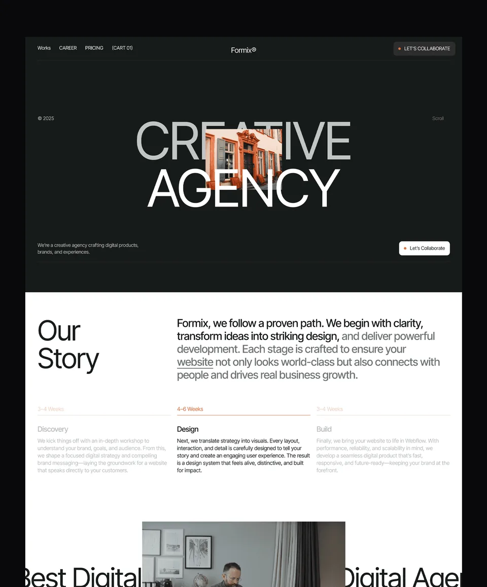
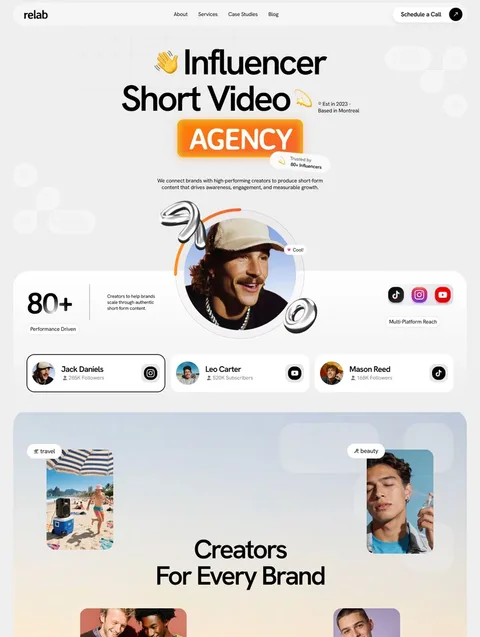
All 40 templates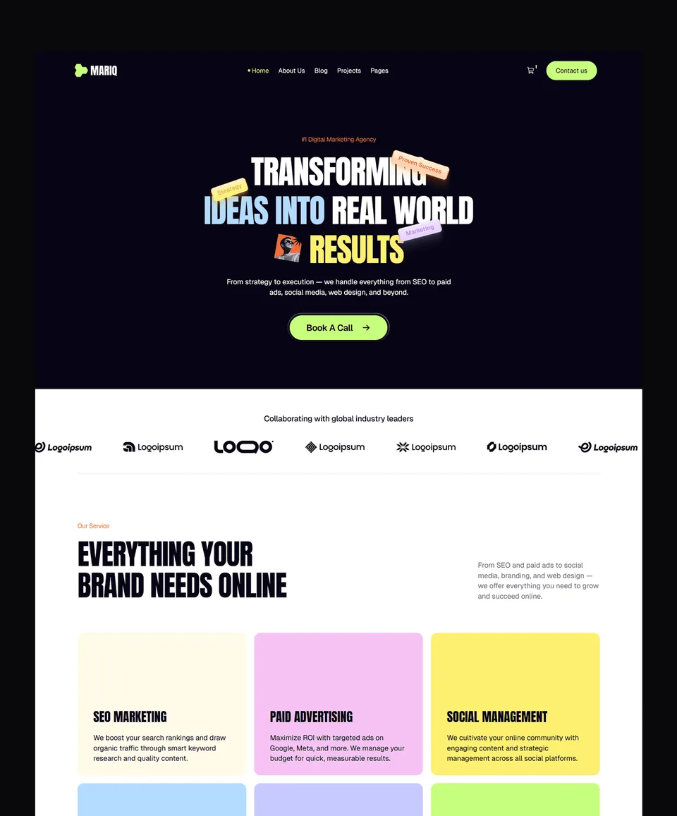

Frequently asked questions
What is a SaaS landing page?
A SaaS landing page is a page built to turn a visitor into a sign-up, trial or demo request for a software product. For most SaaS companies, the homepage does this job for their largest audience.
What should a SaaS landing page include?
A headline that says what the product does, the product shown on screen, a free start button beside a demo or sales button, specific proof near those buttons, a link to pricing and an answer to the main objection.
Should a SaaS landing page show pricing?
It should at least link pricing from the navigation, as all eight examples here do. Some pages, like PostHog's, also answer the cost question in the hero, which removes a reason to leave.
How many calls to action should a SaaS landing page have?
Usually two in the hero: a self-serve action such as "Start for free" and a sales action such as "Book a demo". Repeat the main one further down the page rather than adding new ones.
Can I build a SaaS landing page from a template?
Yes. A template gives you the hero, features, pricing and FAQ sections ready for your copy. Waida's Virion, Lenkrio and Medonix are free on Framer with a free account.
How long should a SaaS landing page be?
Long enough to answer the questions a buyer has before signing up. Self-serve products can stay short; products sold to teams usually need sections on security, integrations and pricing.
The best SaaS landing pages are not clever; they are clear. Name the job in the headline, show the product, offer a free start beside a demo, put specific proof near the buttons and link your pricing. Supabase, Clerk, Loops, Tally, Cursor, PostHog, Lemon Squeezy and Retool all do some version of that.
To start from a working layout, browse our SaaS website templates: Virion, Lenkrio and Medonix are free on Framer with a free Waida account, and the paid versions start at $39.

More from Kazi
Related articles
More in Design Craft
Best Landing Page Templates: 10 Picks for 2026
Ten landing page templates for SaaS products, apps, AI tools and services, across Framer, Webflow, HTML and Next.js, with prices and publishing costs spelled out.
How to Make a Landing Page: A Step-by-Step Guide for 2026
A six-step walk-through for making a landing page in Framer, Webflow or code, from choosing the one action it asks for to publishing and measuring it.
Landing Page Examples: 20 Real Pages and What They Get Right
Twenty real landing pages, checked live today and grouped by the job they do best, with the one idea worth copying from each.