Website Header Design: What Works in 2026
What belongs in a website header, how to structure the navigation, when a sticky header helps and how to build a mobile menu people can actually use.
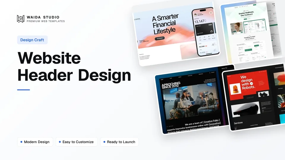
Good website header design does three jobs: it tells visitors whose site they are on, shows them where they can go, and offers one main action. In practice that means a logo linking home, four to seven clearly named menu links, one button, and a mobile menu that is easy to find and easy to close.
What Is a Website Header For?
A website header is the strip at the top of every page that holds the logo, the main navigation and, usually, one call to action. Visitors use it to confirm they are in the right place and to move around the site, so it should look and behave the same on every page.
In HTML the header is the header element, and the menu inside it is a nav element. MDN notes that a header whose context is the body element maps to the banner landmark, which screen reader users can jump to directly (MDN on the header element). MDN also points out that not every group of links needs a nav element; keep it for the major navigation blocks (MDN on the nav element).
The header is not the hero. The headline, the promise and the main image sit in the first section under the header; our hero section design guide covers that part, and the website footer design guide covers the other end of the page.
What to Put in a Website Header
Put in the header only what visitors need on every page: the logo, the main menu and one primary action. Add a search field, a cart, a sign-in link or a language switcher only when your site genuinely has those functions. The table shows when each element earns its place.
Element | Include when | Notes |
|---|---|---|
Logo linking to the home page | Always | Left-aligned on most sites; give the link an accessible name such as the brand name |
Main navigation | Always, unless the site is a single page | Four to seven top-level links, named in your visitors' words |
Primary call to action | Service businesses, SaaS, agencies | One button (Book a call, Get started, Get a quote), styled differently from the links |
Sign-in link | When customers have accounts | A plain text link next to the button, not a second button |
Search | Sites with many pages, products or articles | A visible field or an icon with a label; small brochure sites rarely need it |
Cart | Online shops | Show the item count; keep it in the same corner on every page |
Phone number | Local services where people call (trades, clinics, restaurants) | Make it a tel: link so it works with one tap on a phone |
Announcement bar | A real, time-limited message | One line above the header; remove it when the offer ends |
Language switcher | Sites with translated pages | Label languages in their own language (Deutsch, Français) |
Leave out social icons, long taglines, several competing buttons and anything that only matters on one page. Those belong in the footer or on the page itself, where they do not compete with the main menu.
How to Structure the Navigation
Structure the navigation around what visitors come to do, not around your org chart. List four to seven top-level items, use plain labels such as Services, Work, Pricing, About and Contact, put the most important item first, and move everything else into dropdowns or the footer.
- Label pages by what is on them. "Pricing" beats "Plans & Solutions"; "Work" or "Case studies" beats "Our Journey". Visitors scan, so the label has to match the word already in their head.
- Keep the order stable. WCAG 3.2.3 (level AA) asks that navigation repeated across pages appears in the same relative order each time (W3C, Consistent Navigation). Moving items around between pages breaks that and confuses everyone.
- Show where the visitor is. Mark the current page visually and in code with aria-current="page", which the W3C disclosure navigation example uses on the link for the current page (WAI-ARIA APG disclosure navigation).
- Use dropdowns for groups, not for hiding. A Services dropdown listing four services is useful. A dropdown that hides Pricing or Contact costs you clicks.
- Consider a mega menu only for large sites. A wide panel with labelled columns suits shops, SaaS products with many features and sites with dozens of pages. A site with eight pages does not need one.
For one-page sites, the menu links jump to sections on the same page. Our one-page website design guide covers anchor menus; the sticky-header section below covers the CSS that stops a fixed header from covering the section you jump to.
Header Layout Patterns
Most headers follow one of four layouts: logo left with links on the right, logo left with centred links and a button on the right, a centred logo with links split either side, or a minimal logo-plus-menu-button header. Pick by how many links you have and how strong your main action is.
Layout | Best for | Watch out for |
|---|---|---|
Logo left, links and button right | Most business, agency and SaaS sites | Too many links pushing the button onto a second line on laptops |
Logo left, centred links, button right | SaaS and startups with a clear sign-up action | Centred links need enough space either side to read as a group |
Centred logo, links split either side | Restaurants, fashion, hospitality, editorial brands | Hard to fit a button; the split breaks if one side has more links |
Logo plus menu button on every screen size | Portfolios and studios with few pages and a strong visual style | Hidden navigation is harder to discover; see the mobile section |
Two-tier header (utility bar above main bar) | Shops and large organisations with sign-in, support and locale links | Takes more vertical space, which matters even more if the header is sticky |
Whatever the layout, keep the header on the same grid as the rest of the page, align the logo with the content's left edge and give the primary button enough contrast to stand out from the links without shouting.
Sticky Headers: When They Help
Make a header sticky when visitors scroll long pages and need the menu or the main action again, such as on shops, documentation and long service pages. Keep it short, give it a solid background and test it with the keyboard, because a sticky header can cover the very thing a visitor is trying to reach.
Nielsen Norman Group's guidance on sticky headers recommends keeping them small, giving them strong contrast with the content beneath, keeping motion minimal, considering a partially persistent header that reappears when the visitor scrolls up, and asking whether a sticky header is needed at all. It suggests a slide-in of roughly 300 to 400 milliseconds for headers that reappear.
- Do not cover focused elements. WCAG 2.4.11 Focus Not Obscured (Minimum), level AA, requires that a component receiving keyboard focus is not entirely hidden by author-created content, and names sticky headers as a typical cause (W3C, Focus Not Obscured).
- Offset anchor jumps. Set scroll-padding-top on the html element to the header's height, so in-page links and focused elements land below the header rather than under it. MDN describes the property as defining the top offset of the optimal viewing region of the scroll container (MDN, scroll-padding-top).
- Shrink, do not stack. A tall hero header can shrink to a slimmer bar once the visitor scrolls. Avoid stacking a sticky announcement bar, a sticky header and a sticky cookie banner at the same time.
- Check reflow. At 320 CSS pixels wide (the width WCAG 1.4.10 Reflow uses) the header should still fit without sideways scrolling (W3C, Reflow).
Mobile Header and Menu Design
On a phone, keep the logo, a clearly labelled menu button and, if it matters, one short action such as Call or Book. Hidden menus are less discoverable than visible links, so expose your top two or three items where you can, and make the menu button large, labelled and easy to close.
In a 2016 study of mobile sites, Nielsen Norman Group found that people used navigation on SupermarketHQ, which combined visible and hidden navigation, significantly more (89%) than on Bloomberg (44%), and recommended visible or combination navigation over hiding everything under a menu (NN/g, mobile navigation study). The study is from 2016, but its advice to give navigation a larger, more noticeable footprint still holds.
- Label the button. An icon alone is a guess; the word Menu next to it, or at least an accessible name such as "Open menu", removes the guess.
- Tell assistive technology what the button does. The W3C disclosure navigation pattern uses a button with aria-expanded set to false when the menu is closed and true when it is open (WAI-ARIA APG). The same example warns against the ARIA menu role for site navigation, because it promises application-style behaviour a link list does not have.
- Make targets big enough. WCAG 2.5.8 sets a minimum of 24 by 24 CSS pixels for pointer targets at level AA (W3C, Target Size Minimum); most designers go larger for the menu button.
- Let people close it. A visible close button, the Escape key and a tap outside should all close the panel, and focus should return to the menu button.
Header Accessibility Checklist
An accessible header uses the header and nav elements, offers a skip link, keeps the menu order consistent, marks the current page, never hides focused elements and has text that passes contrast. These checks take ten minutes with a keyboard and catch most header problems before launch.
Check | What to look for | Source |
|---|---|---|
Landmarks | Site header is a header element in the body (banner landmark); main menu is a nav element | |
Skip link | A "Skip to main content" link is the first focusable item, so keyboard users can bypass the header | |
Consistent order | Menu items appear in the same order on every page | |
Current page | Current link styled and marked with aria-current="page" | |
Focus visible | Tabbing through the page never puts a focused element entirely under the sticky header | |
Contrast | At least 4.5:1 for link text, including over images or transparent headers | |
Menu button | Has an accessible name and aria-expanded that updates when opened |
Transparent headers over a hero image are where contrast most often fails: white links that read well over a dark photo disappear over a light one. Add a subtle overlay or switch to a solid background once the page scrolls. Our website launch checklist covers the other pre-launch checks.
Header Examples From Waida Templates
Three of our own templates show the patterns above in working form. We made them, so treat this as our bias; we describe what their live HTML and Astro builds do today, which you can check in the previews. Each template uses the same header on every page.
Finos

Finos, a personal finance template, opens its Astro build with a "Skip to main content" link, groups its inner pages under an All pages dropdown split into Pages and Utilities, uses disclosure buttons with aria-expanded, marks the current page with aria-current and ends the bar with a Get Started button. The mobile menu button is labelled "Open menu". It is free on Framer with a free Waida account, $59 on Webflow, $39 as HTML and $49 for Next.js or Astro.
Medonix

Medonix, a medical SaaS template, uses the classic SaaS layout: a short menu, a Pages dropdown split into Main Pages and Inner pages, and a Get a demo button as the single primary action. It is free on every platform with a free Waida account, Figma file included.
Zelda

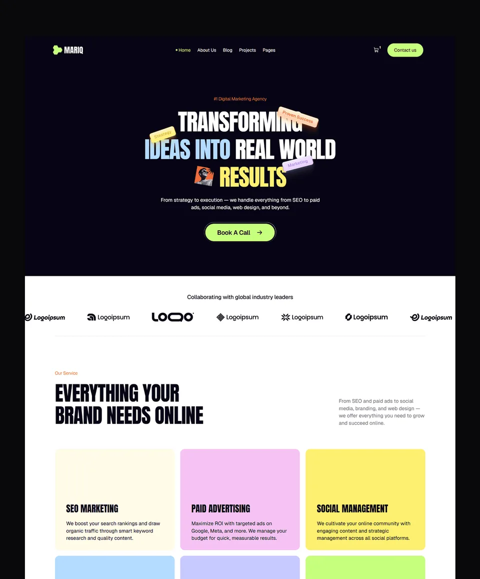
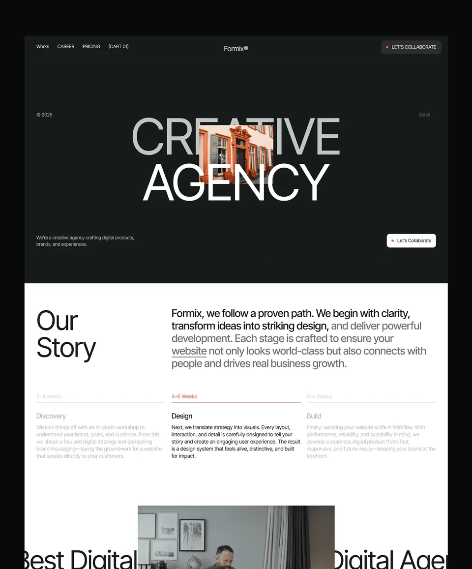
Zelda, a dark design agency template, keeps the header minimal: Home, About, Project, Pricing and Blogs, with a cart icon at the end, which suits a studio site with few pages and a strong visual style. Like Medonix, it is free on every platform with a free Waida account, Figma file included.
If you would rather have the header and menu adapted to your own pages and brand, our template customisation service can do it for you.
Templates to start from
All 46 templates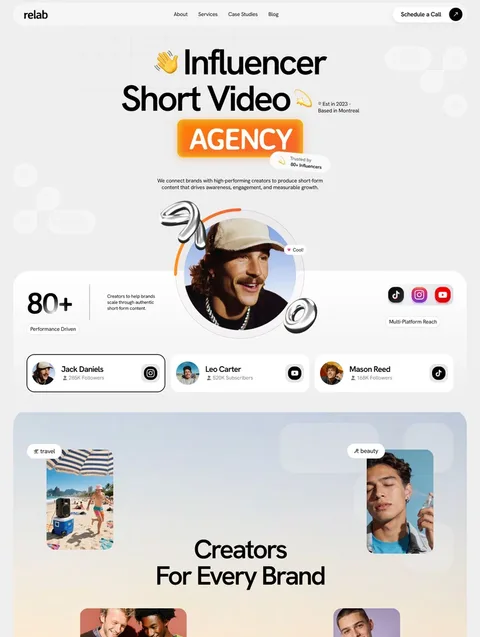


Frequently asked questions
What should a website header include?
A website header should include the logo linking to the home page, four to seven main navigation links and one primary call to action. Add search, a cart, a sign-in link or a phone number only when your site actually needs them.
How many links should be in a website header?
Most sites work best with four to seven top-level links. Group related pages into dropdowns, move secondary pages such as careers, legal and press into the footer, and keep the order the same on every page.
Should my website header be sticky?
Make it sticky when pages are long and visitors need the menu or main action again, such as on shops and long service pages. Keep it slim, give it a solid background and make sure it never hides keyboard-focused elements.
What is the difference between a header and a hero section?
The header is the bar with the logo, menu and main button that repeats on every page. The hero section is the first content block under it, with the page's headline, supporting line, image and call to action.
Is a hamburger menu bad for usability?
Not on its own, but hidden navigation is less discoverable than visible links. On phones, show your top two or three items or label the button Menu, and make it easy to open, close and use with a keyboard.
How tall should a website header be?
There is no fixed rule, but a header should take as little vertical space as it can while keeping links readable and buttons easy to tap. Keep it especially slim when it is sticky, since it covers content on every scroll.
A good website header is small, consistent and honest about where things are: logo home, a handful of plainly named links, one action, a mobile menu that is easy to find, and no sticky bar covering what the visitor is trying to read or focus. Get those right and most visitors never think about the header at all, which is the point.
If you want a header that already follows these patterns, every template in our Framer template collection is free with a free Waida account, and the paid versions for Webflow, HTML, Next.js and Astro start at $39. Pro costs $12 a month billed yearly and adds a template credit every quarter.

More from Kazi
Related articles
More in Design Craft
Pricing Page Design: What Works in 2026
How to lay out plans, billing terms, comparison tables and FAQs so visitors can pick a plan without guessing.
About Us Page Design: What Works in 2026
What an About Us page needs, in what order, how to write the story and show the team honestly, and which proof is worth including.
Contact Page Design: What Works in 2026
What a contact page needs, how short the form should be, how to stop spam without puzzles and how to make every field accessible.