SaaS Website Design: What a SaaS Site Needs to Turn Visitors into Signups
Pages, patterns and pricing: what a SaaS website needs to turn visitors into signups, with real examples and templates to start from.

Good SaaS website design does four things: it says what the product does in one sentence, shows the product rather than describing it, proves it works with customers and numbers, and makes signing up or booking a demo the easiest thing on the page. Below: the pages a SaaS site needs, the patterns the best ones use, with real examples, and templates to start from.
Bias disclosure: the templates at the end are Waida Studio templates, and five of the six are free. The example sites are other companies' work, checked on 11 September 2026; we have no connection with any of them.
The Pages a SaaS Website Needs
Page | What it has to do |
|---|---|
Home | Say what the product does and for whom in one sentence, show it, and put the signup or demo button in view. |
Product or features | Explain each capability by the outcome it gives, with a screenshot, not a paragraph of adjectives. |
Pricing | Plans side by side, what each includes, and the answer to the questions that stop people buying. |
Customers | Case studies and logos from companies your visitor recognises or resembles. |
Integrations | The tools it works with, because "does it connect to what we use?" is often the deciding question. |
Changelog | Proof the product is alive and improving, and a reason for people to come back. |
Blog or resources | Answers to the questions your buyers search for, which is how most of them will find you. |
Signup or demo | As short a form as you can get away with. Every extra field costs signups. |
What the Best SaaS Websites Get Right
A headline with an opinion. Twingate opens with "Security, Performance, Simplicity. Pick Three.", which is more memorable than any list of features and says exactly what the product promises. "The platform for modern teams" could be anyone.
The product in the first screen. Jam's first screen is a video of the product at work, and Peec AI puts its dashboard directly beneath its headline. Visitors understand software faster by seeing it than by reading about it.
New categories explained step by step. Peec AI measures how brands appear in ChatGPT, Perplexity and Gemini, which most visitors have never heard of, so the page walks through the workflow in order: set up prompts, use the data to pick winners, add brands, choose AI models, find sources, act on insights.
Talking to switchers directly. Central, which sells payroll and HR to startups, has a section headed "Gusto → Central". If most of your buyers are leaving a competitor, meet them where they are.
Two audiences, two paths. Whereby serves people who want quick video meetings and developers who want to embed video in their own product, and splits the homepage into a path for each rather than building two websites.
A brand, even for a technical product. Legora sells AI to lawyers and opens on a full-bleed city skyline; Tokens Studio sells design-system automation with a heavy uppercase headline and bright floating interface pieces. Neither looks like the rest of its category.
All seven of those sites happen to be built with Framer; Framer website examples covers them and thirteen others.
Designing the Pricing Page
- Show the plans side by side, with the one most people should choose highlighted.
- Offer a monthly and yearly toggle if you discount annual billing, and say how much the discount is.
- List what each plan includes in plain words, grouped the way buyers think about them, not the way the database stores them.
- Answer the objections underneath: cancellation, refunds, what happens at the limits, and whether there is a free trial.
Common SaaS Website Mistakes
- A vague headline. If the first sentence could describe a competitor, rewrite it.
- Feature soup. Twenty features at equal weight means none of them registers. Lead with the three that win deals.
- Hidden pricing, unless you genuinely sell only through sales conversations. Most buyers read "contact us" as "expensive".
- Illustrations instead of the product. Abstract art is easier to make than good screenshots, and far less convincing.
- A heavy first screen. A large video or animation that loads slowly on a phone costs you the visitors you paid to attract.
SaaS Website Templates to Start From
A template built for software gives you the page structure above on day one. These six come as Framer, HTML, Next.js and Astro templates, and all but Lenkrio as Webflow templates too:


- Virion for a general SaaS or B2B product, free on Framer.
- Lenkrio for AI startups, free on Framer.
- Trenox for fintech and trading products, free on Framer.
- Medonix for health tech, free on every platform.
- Trackeo for travel platforms, free on Framer.
- ShieldifyVPN for security and VPN products.
The best Framer SaaS templates compares these with four more from other designers, including single landing pages for launches.
SaaS templates
All 8 saas templates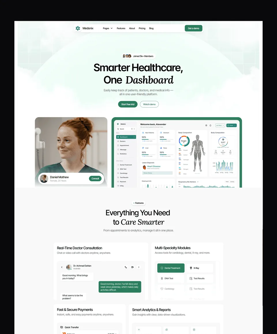

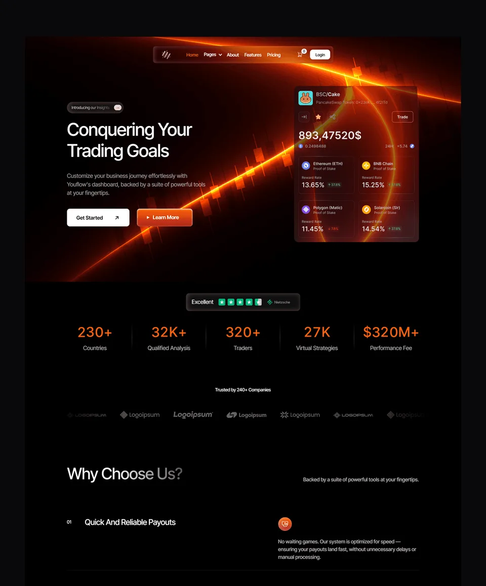

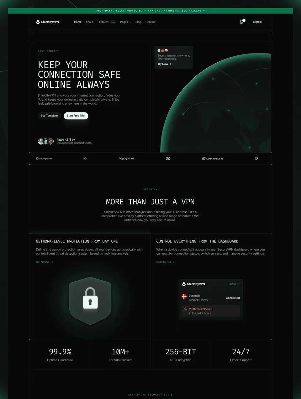

Frequently asked questions
What makes a good SaaS website?
A one-sentence explanation of what the product does and for whom, the product shown on screen, proof from real customers, clear pricing, and a signup or demo button that is always in reach. Everything else is secondary.
How many pages does a SaaS website need?
At launch, a home page, a pricing page and a signup or waitlist page can be enough. As you grow, add feature pages, customer stories, integrations, a changelog and a blog, each of which gives buyers and search engines more to go on.
Should a SaaS company show pricing on its website?
Usually, yes. Most buyers want to know roughly what a product costs before they talk to anyone, and hiding it tends to read as expensive. The exception is software sold only through custom enterprise deals.
What is the best platform for a SaaS website?
Framer is the quickest for a marketing team that wants to ship pages without engineers; Webflow suits sites with a large CMS; Next.js or Astro make sense when the marketing site lives alongside the product's own code. The templates in this guide come in those versions.
How much does a SaaS website cost?
With a template: the template itself (free to $129 at Waida Studio) plus hosting, from $10 a month on Framer's Basic plan or $15 on Webflow's, billed yearly (checked 11 September 2026). A custom design from an agency costs considerably more and varies widely with scope.
The best SaaS websites are specific: one clear sentence, the product on screen, real customers, honest pricing and a short path to signing up. Get those right and the design can be simple; get them wrong and no amount of animation will help. If you are choosing a platform, Webflow vs Framer and Framer pricing cover the costs.

More from Kazi
Related articles
More in Use Cases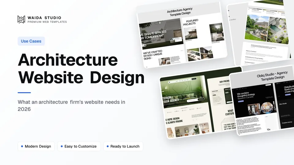
Architecture Website Design: What Wins Commissions in 2026
What an architecture firm's website needs in 2026: a projects archive clients can browse by type, full project pages, fast photography and a clear enquiry path.
Roofing Website Design: What Wins Roofing Jobs in 2026
What a roofing website needs in 2026: a call button for leaks, a quote path for replacements, proof of licence and insurance, and a page per area you serve.

Consulting Website Design: What Wins Clients in 2026
What a consulting website needs in 2026: a sharp positioning line, case studies with numbers, one booking path, and proof of who does the work.