Landing Page Examples: 20 Real Pages and What They Get Right
Twenty real landing pages, checked live today and grouped by the job they do best, with the one idea worth copying from each.
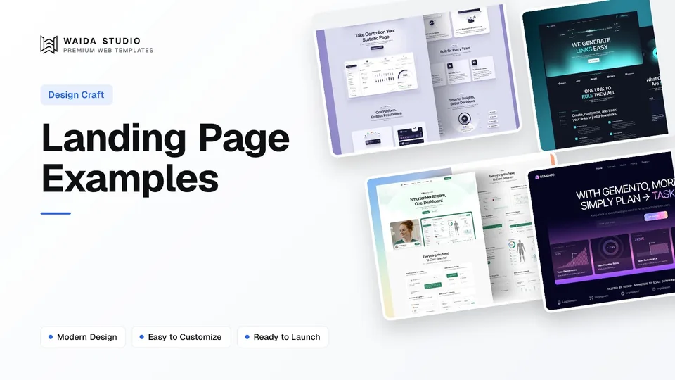
Twenty real landing pages, all checked live today: Linear, Resend and Raycast for headlines, Stripe, Notion and Calendly for splitting self-serve buyers from sales buyers, Loom, Dropbox and Basecamp for proof, and Plausible, Grammarly and Headspace for answering objections on the page. Each entry names one idea you can copy.
Most of these are product homepages rather than one-off campaign pages. That is deliberate: a software homepage does a landing page's job for its highest-traffic audience, and unlike a paid-ads page, it stays online long enough for you to study it. If you want the principles behind them first, read our guide to landing page design.
The 20 at a Glance
Page | Built with (where the page says) | Worth studying for |
|---|---|---|
Linear | Not stated | A headline that names the category |
Resend | Next.js | A three-word headline for one audience |
Raycast | Next.js | A promise short enough to remember |
Descript | Next.js | Naming the product plainly |
Granola | Next.js | Saying what it doesn't do |
Stripe | Not stated | A sales path next to a self-serve path |
Notion | Next.js | Free and demo buttons side by side |
Attio | Not stated | "Start for free" and "Talk to sales" |
Calendly | Not stated | Sign-up with email on the homepage |
Intercom | Next.js | Pricing on the homepage |
Loom | Not stated | A customer count near the top |
Dropbox | Not stated | One big user number |
Basecamp | Not stated | Customers answering one question |
Zapier | Not stated | Speaking to the sceptic |
Cal.com | Framer | A testimonial wall on a Framer site |
Plausible | Jekyll | Positioning against the incumbent |
Grammarly | Not stated | Plans compared on the homepage |
Headspace | Next.js | A free trial and an FAQ |
Framer | Framer | Handling the "is this a toy?" objection |
Webflow | Webflow | Listing what is built in |
The "Built with" column comes from each page's own response headers or generator tag, fetched today. Where a page doesn't say, we don't guess.
Headlines That Do the Work
These five pages let the headline carry the pitch: one line that tells a stranger what the product is and who it is for, before any feature list.
1. Linear
Linear's headline calls it "the product development system for teams and agents", which names both the category and the buyer in one line. Below it, the page walks through the workflow in order (intake, planning, building, shipping) and puts its changelog near the end, which quietly shows the product is actively maintained. Visit Linear
2. Resend
Resend's headline is three words: "Email for developers". It turns away everyone else on purpose, then earns the developer's trust with sections on test mode, webhooks and writing emails in React. If your audience is narrow, a headline this short is a feature, not a risk. Visit Resend
3. Raycast
"Your shortcut to everything" is a promise short enough to repeat to a colleague. The sections that follow keep the same clipped voice ("There's an extension for that", "Don't repeat yourself"), so the whole page reads as one idea rather than a list of features. Visit Raycast
4. Descript
Descript's H1 is simply "AI Video Editor": the words a searcher would type. The meta description does the explaining (editing video as easily as editing text), and the page includes a frequently asked questions section and a "Get started for free" button, so the plain headline never has to do everything alone. Visit Descript
5. Granola
Granola positions itself as "the AI notepad for back-to-back meetings", and its description adds the line that sets it apart: notes "without a meeting bot". Saying what a product doesn't do is a fast way to separate it from a crowded category, and the page ends by stating the free offer outright: unlimited meeting notes for free. Visit Granola
Two Buttons for Two Buyers
These five pages serve two audiences at once, a person who wants to try the product today and a company that needs to talk to someone first, and they give each a separate button instead of forcing one path.
6. Stripe
Stripe's headline promises infrastructure "from your first transaction to your billionth", which speaks to a startup and an enterprise in the same sentence. The navigation keeps "Contact sales" and "Sign in" apart, and a startups link sits alongside them, so each kind of visitor finds a door without reading the whole page. Visit Stripe
7. Notion
Notion puts "Get Notion free" and "Request a demo" next to each other. The free button is for the individual who will decide in five minutes; the demo button is for the team lead who has to justify the purchase. Further down, a "Trusted by teams that ship" section speaks to the second group. Visit Notion
8. Attio
Attio's two calls to action are "Start for free" and "Talk to sales", and its proof line is specific: "Trusted by 30,000+ customers". A number with a unit is easier to believe than "trusted by thousands", and it answers the sales-led buyer's first question before they ask it. Visit Attio
9. Calendly
Calendly's headline, "All the work around meetings, handled", widens the product beyond scheduling, and the page offers a "Sign up with email" button alongside a "Talk to sales" link. Putting the first step on the landing page removes a click for the self-serve buyer. Visit Calendly
10. Intercom
Intercom has a "Transparent pricing" section on its homepage, alongside "Start free trial" and "Contact sales". Showing pricing on the landing page filters out visitors who can't afford the product and reassures those who can, which saves both sides a sales call. Visit Intercom
Proof Near the Top
These five pages put evidence where a sceptical visitor looks first: a customer count, a user number or customers speaking in their own words.
11. Loom
Loom's headline is a proverb turned into a pitch: "One video is worth a thousand words". The very next section states the proof as a number: millions of people across 400,000 companies choose Loom. Its sign-up button, "Get Loom for free", repeats the offer so the visitor never wonders what it costs to start. Visit Loom
12. Dropbox
Dropbox leads with a relaxed headline, "Get to work, with a lot less work", and follows it with one large number: over 700 million registered users. For a product people already know, one big figure does more than a wall of logos. Visit Dropbox
13. Basecamp
Basecamp's headline takes a side: "project management without all the nonsense". Its proof section is built around a single question it put to customers, what changed for the better since they switched, which produces answers about outcomes instead of generic praise. It also offers a live demo for people who want to ask questions first. Visit Basecamp
14. Zapier
Zapier speaks directly to the sceptical buyer with a section titled "No AI hype here. Just results." That line acknowledges what the visitor is already thinking about AI tools, and the page backs it with a customer-story section and a "Start free with email" button. Visit Zapier
15. Cal.com
Cal.com's homepage runs on Framer, according to its own generator tag, which makes it a useful reference if you build on Framer too. Its headline, "The better way to schedule your meetings", is followed later by a "Don't just take our word for it" testimonial section and a section on the tools it syncs with. Visit Cal.com
Answering Objections on the Page
These five pages expect the visitor's doubts, about price, trust or whether the product is serious, and answer them before the visitor leaves to search elsewhere.
16. Plausible
Plausible's headline positions it against the product its visitors already use: an "easy to use and privacy-friendly Google Analytics alternative". The page includes a section called "It's time to ditch Google Analytics" and shows traffic-based plans on the homepage, so a switcher sees the reason and the price in one visit. Visit Plausible
17. Grammarly
Grammarly compares its Free, Pro and Enterprise plans on the homepage and pairs its "Get Grammarly" button with the words "It's free". Stating that the first step costs nothing, right at the button, answers the most common objection at the exact moment someone decides whether to click. Visit Grammarly
18. Headspace
Headspace asks "What kind of headspace are you looking for?" to route visitors by need, offers a free trial in several places and ends with a frequently asked questions section. For a consumer subscription, an on-page FAQ handles the billing and cancellation doubts that would otherwise stop a sign-up. Visit Headspace
19. Framer
Framer's homepage runs on Framer, confirmed by its server header, and it answers the objection that a design tool can't run a real website. One section is titled "Not just vibes, a full platform", and its description lists hosting, security, analytics, CMS and SEO as built in. A "Shipped with Framer" section then shows customer sites. Visit Framer
20. Webflow
Webflow's homepage runs on Webflow, confirmed by its generator tag, and its description does the objection handling: CMS, hosting and security are listed as built in, alongside a claim of over 300k teams. One of its buttons reads "Get started — it's free", which answers the price question in the button itself. Visit Webflow
What the Best Landing Pages Have in Common
The strongest pages share five habits: a headline that names the product and the buyer, a first step that is free or clearly priced, proof with a specific number, a separate path for sales-led buyers, and a section that answers the main doubt.
Habit | Seen on | How to copy it |
|---|---|---|
Headline names the product and the buyer | Linear, Resend, Granola | Write one line a stranger could repeat; cut adjectives |
First step is free, and the button says so | Grammarly, Loom, Webflow | Put "free" or the price inside the button label |
Proof with a specific number | Attio, Loom, Dropbox | Use a count with a unit, and only one you can stand behind |
Separate self-serve and sales paths | Notion, Stripe, Intercom | Two buttons: one to start, one to talk |
The main doubt answered on the page | Plausible, Framer, Headspace | Add a comparison, pricing or FAQ section |
None of these needs a big budget. They are copy and structure decisions, which is why a well-built template gets you most of the way: the sections are already in the right order, and your job is to write the specific version for your product.
Build Your Own from a Waida Template
If you want these patterns without starting from a blank canvas, these four SaaS templates are Waida Studio's own, so weigh our bias accordingly. Each includes a hero, features, social proof and pricing sections you can rewrite for your product.
Virion

Virion is a SaaS startup template with 12 pages. It is free on Framer with a free Waida account, $59 on Webflow, and available as HTML ($39), Next.js ($49) and Astro ($49) code.
Lenkrio

Lenkrio is built for AI startups and SaaS products, with 12 pages. It is free on Framer with a free Waida account, and available as HTML ($39), Next.js ($49) and Astro ($49) code.
Medonix

Medonix is a medical SaaS template with 13 pages, and it is free on every platform (Framer, Webflow, HTML, Next.js and Astro) with a free Waida account, Figma file included.
Gemento

Gemento is a dark SaaS and task-management template with 27 pages, including an integration directory and three-tier pricing. It is a code template: HTML ($39), Next.js ($49) or Astro ($49), with no framework needed for the HTML version.
For more options, see all SaaS website templates, our list of the best Framer SaaS and landing page templates, or the best Next.js landing page templates if you want to own the code.
Templates to start from
All 39 templates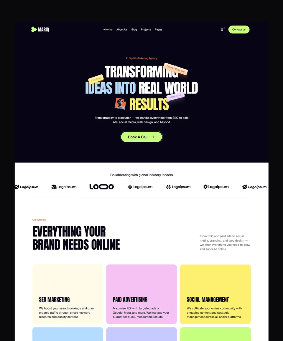




Frequently asked questions
What is a landing page?
A landing page is a web page built around one action, such as signing up, booking a demo or buying. It removes distractions so the visitor either takes that action or leaves.
Is a homepage a landing page?
A homepage can work as a landing page when it focuses on one main action, as software homepages like Notion and Loom do. A campaign landing page is usually narrower, written for one ad or audience.
What should a landing page include?
A clear headline naming the product and buyer, one primary call to action, specific proof such as a customer count, and a section that answers the main objection, whether that's price, trust or effort.
How many calls to action should a landing page have?
One primary action, repeated through the page. Pages selling to both individuals and companies often add a second path, such as a free sign-up plus a sales-contact button, as Notion and Stripe do.
Can I build a landing page like these without coding?
Yes. Cal.com's and Framer's own homepages run on Framer, and Webflow's runs on Webflow. Starting from a template gives you the section order, so you only write and swap in your own content.
The best landing page examples aren't memorable because of their visuals. They are memorable because the headline says what the product is, the button says what the first step costs, and the page answers the visitor's main doubt before they leave. Pick two or three of the pages above that match your buyer and copy the structure, not the words.
To build one, start from our Framer templates, where 19 are free with a free Waida account, or browse SaaS templates across every platform. Paid Framer and Webflow templates cost $49 to $129 each; a template licence covers unlimited projects for one person, as set out in our licence terms. For the full principles, read SaaS website design.

More from Kazi
Related articles
More in Design Craft
How to Design a Portfolio Website: What Works in 2026
A practical guide to designing a portfolio website: who it is for, the pages it needs, how to write case studies and how to make contact easy.
Services Landing Page Design: What Converts in 2026
A practical guide to designing a landing page for a service business: sections, proof, one CTA, and four Waida templates built for it.
Landing Page Design: What Converts in 2026
What separates a landing page that converts from one that doesn't, section by section, with a checklist and examples from Waida's own SaaS templates.